The Rayleigh Channel Model is a statistical model used for simulating mobile radio systems, particularly beneficial in representing multipath fading environments. In this model, it is assumed that signals reach a receiver from various directions without a clear line of sight. (NOTE : If there is a dominant line of sight, Rician fading may be more applicable.)
Also, in this model, we assume that the magnitude of a signal that has passed through the channel will follow a Rayleigh distribution. The model considers only the envelope of the received signal strength, thereby neglecting the phase of the signal.
- Intuition about Rayleigh Distribution
- Signal Generation for Rayleigh channel
- Mathematical Presentation of Rayleigh Channel
- Where does Rayleigh fading appear in the LTE specifications?
- Reference
Intuition about Rayleigh Distribution
Start with the shape, because the shape is the argument. A Rayleigh envelope is not a bell curve, and the three pictures below exist to show that difference directly. The difference is visible in where each curve touches zero.
Simple definition of Rayleigh Channel is a channel which shows Rayleigh distribution of power profile as shown below. (See Rayleigh Distribution section for mathematical definition of the distribution).
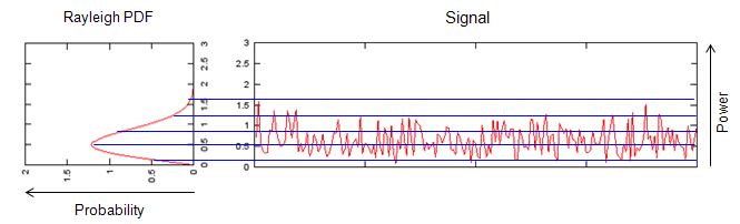
The probability axis points left so that it lines up with the power axis of the signal beside it. Read across from a level on the right and the curve on the left tells you how often the signal sits there.
Two panels, one shared vertical scale : the left panel is titled Rayleigh PDF and the right one Signal. Both run from 0 to 3, and the right panel labels that axis Power.The distribution is drawn sideways on purpose : its own axis is labelled Probability with the arrow pointing left. Turning it that way puts each probability next to the signal level it belongs to.The curve starts at zero and stays on one side : it rises from the bottom of the axis, peaks below 1, and tails off upward. There is nothing below zero, because a magnitude cannot be negative.The signal never crosses the axis either : the red trace wanders between roughly 0 and 1.5 and never goes negative. That is what makes it an envelope rather than a waveform.The blue horizontal lines connect the two panels : each one is a power level. The width of the PDF at that level is how much of the time the signal sits near it.The deep dips are the point of the whole page : the trace drops close to zero several times. Each of those is a fade, and the thin lower tail of the PDF is what predicts them.
Just for your reference, I put down an example of Gaussian channel as shown below.
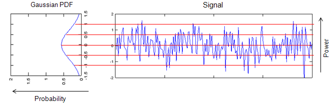
The same drawing for a Gaussian channel, and the contrast is the whole reason it is here. This curve is symmetric about zero and the signal crosses zero constantly, which is what an envelope never does.
The left panel is titled Gaussian PDF : it is symmetric, it peaks at zero, and it extends to both sides. Nothing about it is one-sided.The axis now runs from -1.5 to 1.5 : negative values are ordinary here, where the Rayleigh panel had none at all.The signal oscillates about zero : the blue trace crosses the centre line on almost every excursion, and the red horizontal lines sit symmetrically above and below it.Most of the time is spent near the middle : the peak of the curve is at zero. The commonest value here is the one the Rayleigh channel treats as a deep fade.Put the two pictures side by side and the relationship appears : the Gaussian is what the I and Q components each look like. The Rayleigh is what their magnitude looks like. The next section builds one from the other.
Why is this distribution important ? In wireless communication, it is important because this is very important modeling for faded channels in wireless communication. In most cases, the channels for reflected path is modeled in Rayleigh model as shown below.
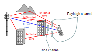
One label per geometry. Rayleigh is the case where the drawing has no straight line from the tower to the phone, and Rice is the case where it does.
Two receivers, two labels : the picture writes Rayleigh channel against the phone on the right and Rice channel against the one lower down. Same tower, same buildings, different answer.Three kinds of path are drawn and named : Reflected wave in red off the buildings and the hill, and Diffracted wave where the path bends over an edge. Direct wave is the blue one, straight from the tower.The blue direct wave reaches only one of them : that single line is the whole difference between the two labels.Rayleigh is the no-line-of-sight case : when every arriving path is reflected or diffracted, no one component dominates, and the sum of many comparable paths is what produces the distribution.Rice is Rayleigh plus a dominant path : add the direct wave back and the envelope stops visiting zero so often. That is why deep fades are rarer with line of sight.
Rayleigh describes a magnitude, not a waveform : that is why the curve is one-sided and the Gaussian is not.The thin tail near zero is the engineering problem : everything about fade margins and diversity comes from how often the envelope visits it.The model is a statement about geometry : many comparable paths and no dominant one. Change that assumption and the distribution changes with it.Rice and Rayleigh differ by one path : the picture makes that concrete, and it is the reason indoor and line-of-sight links behave differently.
Signal Generation for Rayleigh channel
The recipe below is four lines long and it works, but it is worth knowing why it works. Two Gaussians are not an arbitrary choice, and the magnitude step is where the Rayleigh shape actually comes from. Let's follow the recipe first and then see why it works.
There are a couple of ways to generate the signal for Rayleigh channel. The simplest way is as shown below and overall procedure is as follows.
i) Generate a random signal with Guassian distribution
ii) Generate another random signal with Guassian distribution
iii) Combine the signal i) and ii) to make a complex signal.
iv) Take the magnitude of the complex signal and the distribution of the magnitude value follows Rayleigh distribution.
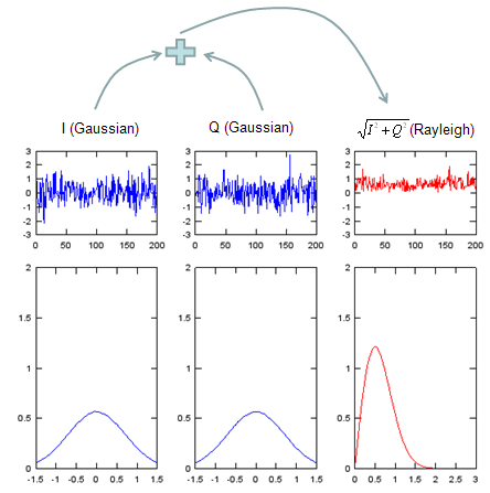
Two ordinary Gaussians go in and something one-sided comes out. Nothing was added between them except the magnitude, so the whole of the Rayleigh shape is produced by that one operation.
Three columns, and the headings say what each one is : I (Gaussian), Q (Gaussian), and on the right the square root of I squared plus Q squared, labelled (Rayleigh).The arrows across the top show the combination : the two left columns feed a plus sign, and the result feeds the right column.The upper row is time, the lower row is the histogram : each column has a trace running to about 200 samples above, and the distribution of that trace below.The two input traces are blue and symmetric : both swing between roughly -3 and 3, both cross zero constantly, and both histograms are centred bells.The output trace is red and never negative : it sits between 0 and about 3, and its histogram rises from zero, peaks near 1, and tails off to the right.The horizontal scales are not the same : the two input histograms run from -1.5 to 1.5 and the output one from 0 to 2.5. Comparing widths by eye across the columns will mislead.
Click here to download Matlab/Octave code for the plots shown above.
Now for why it works, because the four steps do not say. Think of one instant as a single point in the I and Q plane. Both coordinates are Gaussian and independent, so the cloud of points is circular and densest at the origin, and the envelope R is just that point's distance from the centre.
Asking how often R lands near some value r means asking how many points fall in a thin ring at radius r. Two things decide that, and they act in opposite directions. The ring gets longer as r grows, which raises the count in proportion to r. The density of points falls off as exp(-r2 / 2σ2), which lowers it. Multiply the two and the result is the Rayleigh density.
That product also explains the shape everyone notices first. At r = 0 the ring has no length at all, so the density is exactly zero there no matter how crowded the middle of the cloud looks. The diagram below draws both factors together.
The origin is the busiest single point in the cloud and still the least likely envelope, because a ring of zero radius has no room in it. Those two effects together are the whole derivation.
Two Gaussians are not a trick : they are the I and Q components of a sum of many independent paths. The central limit theorem makes that sum Gaussian, whatever the individual paths look like.The magnitude step creates the asymmetry : both inputs are symmetric about zero, and the output cannot be negative. Nothing else in the recipe does that.p(0) = 0 is geometry, not approximation : a ring of radius zero has no area, so an exact hit on the origin has no probability.The peak sits at σ : that is where the growing ring and the falling density balance, and it is the mode listed in the section below.The phase is uniform and carries no information here : a circular cloud looks the same from every angle, which is why only the radius has a named distribution.
Mathematical Presentation of Rayleigh Channel
The formula below has one parameter in it, and almost every number an engineer wants can be written in terms of that one parameter. So it is worth collecting them in one place, and worth answering the question the picture in this section asks and leaves open.
A simple, one-dimensional representation of the Rayleigh distribution is as follows:
If the real and imaginary parts of a received signal are modeled as independent and identically distributed (i.i.d.) Gaussian random variables, then the amplitude (or envelope) of the signal, R, can be represented as follows:
R = sqrt(X2 + Y2),
where X and Y are zero-mean Gaussian random variables with equal variance. R represents the magnitude or the envelope of the signal. In wireless communication like LTE, X and Y can be I and Q data.
The probability density function (PDF) of R (the envelope) is given by the Rayleigh distribution as follows:
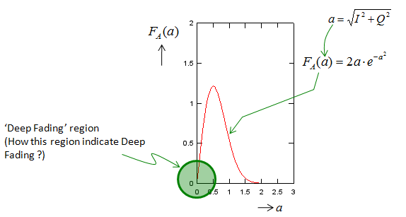
The green ring at the origin is the part a link budget has to pay for. The question written beside it is answered further down this section, in decibels and in percentages.
The picture uses a and the text uses r : it writes a = sqrt(I2 + Q2) where the text writes R = sqrt(X2 + Y2). Same quantity, and the horizontal axis is labelled a.The label FA(a) is a density here : a capital F usually means a cumulative distribution. The curve drawn is the probability density, which is what the text calls p(r).The curve starts at zero, peaks, then decays : it leaves the origin, reaches its maximum before a = 1, and is back down near zero by about a = 2.The equation written on it is one particular case : FA(a) = 2a·e-a2 is the general formula further down with σ2 = 1/2. It is not a different distribution.The drawn curve is a different case again : it peaks at about a = 0.5 with a height of about 1.22, which is σ = 0.5. The labelled equation would peak at a = 0.707 with a height of 0.86. Take the shape from the picture and the numbers from the formula.The green circle marks the deep fading region : it sits on the origin, over the part of the curve where the density is smallest and the consequences are largest.
Rewriting the equation in terms of
p(r) = (r / σ2) * exp(-r2 / 2σ2), for r ≥ 0,
where σ2 is the variance of the Gaussian random variables I and Q, r represents the envelope (magnitude) of the signal.
In a wireless communication system, σ2 is typically proportional to the average received power, which depends on factors such as the distance between the transmitter and the receiver, and the power of the transmitted signal.
Every one of these follows from the single parameter σ, so fixing one of them fixes all the others. The last row is the one to remember, because a link budget is written in average power rather than average amplitude.
|
Quantity |
In terms of σ |
Multiple of σ |
What it is good for |
|
|
σ |
1.000 |
Where the curve turns over. Reading σ straight off a plotted PDF |
|
|
σ√(2 ln 2) |
1.177 |
Half the time the envelope is below this |
|
|
σ√(π/2) |
1.253 |
The average amplitude, which is not the same as the average power |
|
|
2σ2 |
− |
The quantity a link budget and a received power measurement report |
|
|
σ√2 |
1.414 |
The reference level that fade depths below are measured from |
The mode, the median and the mean are three different numbers, and they sit in that order. The mean is about 2 dB above the mode and the r.m.s. about 3 dB above it, so picking the wrong one moves a fade margin by that much.
Now the question the picture asks. Deep fading is not a separate mechanism, it is just the lower tail, and the tail has a closed form. For any level x, the envelope falls below it with probability 1 − exp(−x2 / 2σ2). Measure that level as a fade depth below the r.m.s. envelope and the answer stops depending on σ altogether.
|
Fade depth below r.m.s. |
Envelope ratio |
Probability |
Roughly |
|
|
0.708 |
39.4 % |
More than a third of the time |
|
|
0.316 |
9.52 % |
About one time in eleven |
|
|
0.100 |
0.995 % |
About one time in a hundred |
|
|
0.032 |
0.100 % |
About one time in a thousand |
Below about 10 dB the pattern is a clean one: every extra 10 dB of fade depth divides the probability by ten. That is the rule of thumb worth remembering from this page.
One parameter sets everything : mode, median, mean and r.m.s. are all fixed multiples of σ, so any one of them determines the rest.Mean power is 2σ2, not the square of the mean envelope : the mean envelope squared is 1.57σ2. Confusing the two is a 1 dB error before anything else goes wrong.Fade depth is σ free : express a level as a ratio to the r.m.s. envelope and the probability no longer depends on how strong the signal is on average.Ten decibels per decade of probability : 10 dB happens about a tenth of the time, 20 dB about a hundredth, 30 dB about a thousandth.That is why diversity exists : two independent Rayleigh branches are both 20 dB down only about one time in ten thousand. Combining them is cheaper than buying 20 dB of transmit power.
Where does Rayleigh fading appear in the LTE specifications?
This page sits in the LTE handbook, so it is fair to ask where any of it is written down for LTE. The answer is Annex B of 36.101, and it is worth seeing exactly what that annex fixes and what it leaves to the model.
36.101 clause B.2 lists what a multipath propagation condition consists of, and it names three things. A delay profile in the form of a tapped delay line, characterised by a number of taps at fixed positions on a sampling grid. A combination of channel model parameters including that delay profile and the Doppler spectrum, characterised by a classical spectrum shape and a maximum Doppler frequency. And a set of correlation matrices for the antennas when there is more than one.
Clause B.2.1 then gives three delay profiles, chosen to represent low, medium and high delay spread environments. The naming in clause B.2.2 attaches the Doppler figure to them: a condition written EPA5 or EVA70 or ETU300 is one of these profiles with that maximum Doppler frequency in hertz.
|
Model, 36.101 Table B.2.1-1 |
Channel taps |
Delay spread (r.m.s.) |
Maximum excess tap delay |
|
|
7 |
43 ns |
410 ns |
|
|
9 |
357 ns |
2510 ns |
|
|
9 |
991 ns |
5000 ns |
Three profiles spanning a factor of twenty in delay spread. Each tap of each profile is an independently faded path, which is where the distribution on this page enters an LTE test.
One honest caveat about that annex, because it is easy to over-claim. 36.101 never uses the word Rayleigh, anywhere in the document. It fixes the tap delays, the relative tap powers and the Doppler spectrum, and it leaves the amplitude statistics of each tap to the classical model those parameters imply. So the distribution on this page is the one behind an EPA or EVA or ETU test, but you will not find it named in the specification that defines them.
36.101 Annex B.2 is where LTE pins this down : tapped delay line, classical Doppler spectrum, and antenna correlation matrices.The number in EPA5 or ETU300 is the Doppler frequency : clause B.2.2 says so directly, in hertz.Delay spread spans a factor of twenty across the three : 43 ns for EPA against 991 ns for ETU. That is the difference between a flat channel and a strongly frequency selective one.The annex specifies powers and delays, not distributions : the word Rayleigh does not appear in 36.101 at all, so treat the connection as implied by the classical model rather than stated.Each tap fades independently : a nine tap ETU channel is not one Rayleigh process but nine, which is why frequency diversity works at all.
Reference
- 36.101 : 3GPP - E-UTRA; User Equipment (UE) radio transmission and reception, v20.0.0. Annex B.2 (multi-path fading propagation conditions), Table B.2.1-1 and the tapped delay line models in Tables B.2.1-2, B.2.1-3 and B.2.1-4.
- Rayleigh Distribution : the exponential function page on this site, which the section above links to for the distribution itself.