Parametric Plot is a special type of techique to plot a data set. As you see in the illustration shown below, in ordinary graph the horizontal axis is mapped to the independent variable of a function and vertical axis is mapped to the dependent variable (i.e, the function value). But in Parametric Plot, both horizontal axis and vertical axis are dependent variables (i.e, the function values). The two axis in Parametric plot is determined by an hidden independent variable called 'parameter'.
In engineering, this is one of the most frequently used form of graph. If you are new to this concept, I recommend you to read through this over and over until you clearly understand the concept.
- How does a parametric plot differ from an ordinary graph ?
- How does the example data look in ordinary graphs ?
- What does the parametric plot of the same data show ?
- Where do parametric plots appear in engineering ?
How does a parametric plot differ from an ordinary graph ?
The difference is in what each axis carries. Let's compare the two kinds of graph side by side before we look at any numbers, because the same idea repeats in every example after this one.
The illustration below puts an ordinary function on the left and a parametric function on the right. On the left, the horizontal axis is the independent variable t, and the vertical axis is the value f(t). A point on the curve is (t, f(t)). On the right, both axes carry function values, f(t) on the horizontal axis and g(t) on the vertical axis. A point on the curve is (f(t), g(t)), and t itself does not appear on any axis.
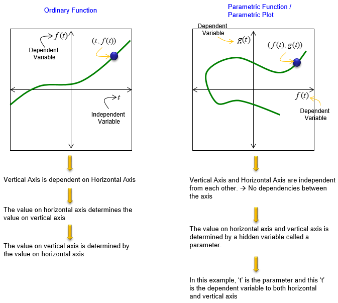
In the ordinary graph, the horizontal axis decides the vertical value : each t gives exactly one f(t), so the curve always moves forward along the t axis.In the parametric plot, the two axes do not depend on each other : both depend on the hidden parameter t. So the curve can loop, turn back and cross itself, as the green curve on the right does.A labelling slip in the illustration : the last note on the right says that t is the dependent variable to both axes. It should read independent variable. The parameter t is the independent variable, and f(t) and g(t) are the dependent variables, as the axis labels on the same drawing show.
It may not be so clear to you yet just by the explanation shown above. Let's take a look at a specific example.
How does the example data look in ordinary graphs ?
The example uses one parameter and two functions of it. We start with the table of numbers and draw it in the ordinary way first. This shows how much the ordinary graph needs to carry the same information.
Let's suppose we have a data set as shown below. In this example, 't' is independent variable and they are given. x(t) is determined by 't' based on the function cos(2 pi t). y(t) is determined by 't' based on the function sin(2 pi t).
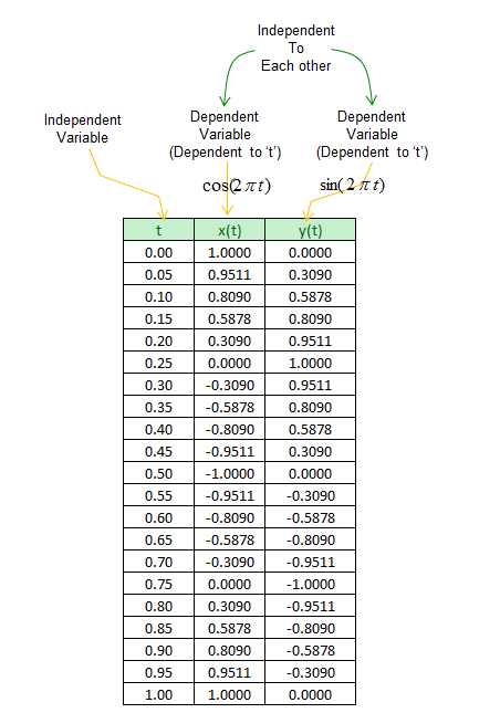
The table runs t from 0 to 1 in steps of 0.05, which is 21 rows and exactly one full period of both functions. The values are rounded to four digits. For example, t = 0.05 gives cos(0.1π) = 0.9511 and sin(0.1π) = 0.3090, and t = 0.25 gives x = 0 and y = 1.
Now let think of how to represent these data in Ordinary Graph. In order to represent x(t) and y(t) in ordinary graph, we need to draw two plots as shown below.
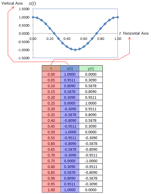
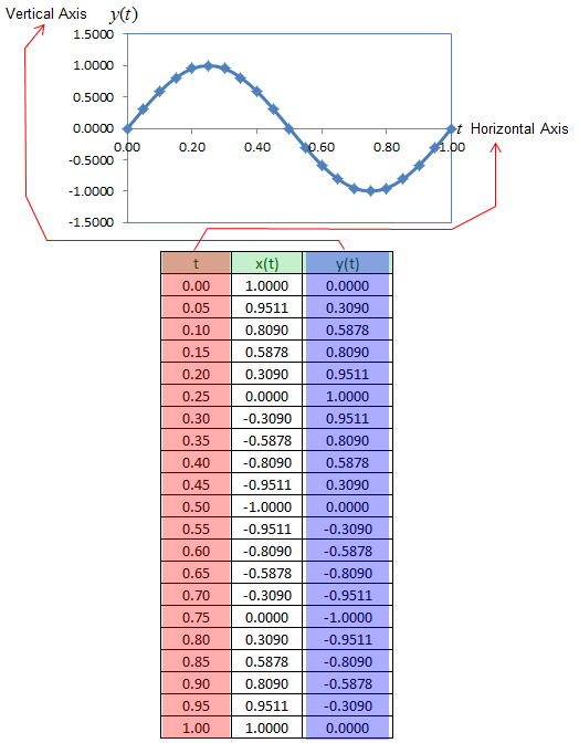
In the x(t) graph, the t column goes to the horizontal axis and the x(t) column goes to the vertical axis. The result is one period of a cosine, starting at 1, reaching -1 at t = 0.5, and returning to 1 at t = 1. In the y(t) graph, the same t column is paired with the y(t) column, and the result is one period of a sine. Each graph shows how one function changes with t. But neither graph shows how x and y relate to each other at the same moment.
Two functions of t need two ordinary graphs : the t axis is shared, so each graph can carry only one of the two functions.The relation between x and y stays hidden : you have to read both graphs at the same t to find one point (x, y).
What does the parametric plot of the same data show ?
Now we drop the t axis and pair the x(t) column with the y(t) column directly. The same 21 rows then produce one graph instead of two, and a shape appears that neither ordinary graph showed.
If you represent this as a parametric plot, you can represent both x(t) and y(t) in a single graph as shown below. In this case, the independent variable 't' is not directly visible in the plot.
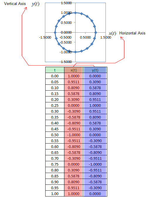
The points form a circle of radius 1 around the origin. We can prove that without the plot. Since cos2θ + sin2θ = 1, every row satisfies x2 + y2 = 1. Removing t like this is called eliminating the parameter, and it gives the ordinary equation of the curve when it exists.
The parameter t is invisible, but it is not lost completely. The order of the points tells the direction. The curve starts at (1, 0) for t = 0, reaches (0, 1) at t = 0.25 and (-1, 0) at t = 0.5, so it runs counterclockwise. The spacing of the points tells the speed. Here the points are evenly spaced, because the angle 2πt grows at a constant rate.
The slope of the curve also comes from t. The chain rule gives dy/dx = (dy/dt) / (dx/dt). For this circle, dx/dt = -2π sin(2πt) and dy/dt = 2π cos(2πt). At t = 0.125 the point is (0.7071, 0.7071), and the slope is -1, which is the tangent of a circle at 45 deg.
One parametric plot replaces the two ordinary graphs : each row of the table becomes one point (x(t), y(t)).The shape shows the relation between x and y : here it is x2 + y2 = 1, which neither ordinary graph shows.Direction and speed need markers or labels : a plain line drawn through the points would show the circle, but not where it starts or which way it goes.A curve can fail the vertical line test and still be a parametric curve : the circle has two y values for most x values, so y is not a function of x. But x(t) and y(t) are both ordinary functions of t.
Where do parametric plots appear in engineering ?
The introduction called this one of the most frequently used graphs in engineering. Let's see why. Many engineering quantities come as two signals that change with the same time or frequency, and the relation between the two signals matters more than either signal alone.
The oscilloscope in XY mode is the classic case. It puts one signal on the horizontal axis and another on the vertical axis, and time becomes the hidden parameter. The drawing below shows x(t) = sin(2πt) and y(t) = sin(2πt + phase) for three phase differences. The two signals have the same frequency in every case, and only the phase changes.
Figure 1. XY plots of two sine waves with the same frequency. A phase difference of 0 deg gives a straight line, 45 deg gives a tilted ellipse, and 90 deg gives a circle, so the shape measures the phase.
The line at 0 deg : x and y are always equal, so every point falls on y = x.The ellipse at 45 deg : the curve crosses the y axis where x = 0, at y = +/- sin(45 deg), about +/- 0.71. In general these crossings are at +/- sin(phase), which gives a way to read the phase off the screen.The circle at 90 deg : one signal is a sine and the other a cosine, which is the example of the previous section with the axes and the start point changed.
The same idea appears in several other places. An IQ constellation plots the Q component against the I component, and the sample time is the parameter. A Nyquist plot in control engineering draws the imaginary part of a transfer function G(jω) against its real part, and the frequency ω is the parameter. A trajectory in the x-y plane, such as the path of a satellite, uses time as the parameter.
Ask what the hidden parameter is : in an XY scope trace it is time, in a Nyquist plot it is frequency, and in a constellation it is the sample index.The shape of the curve carries the relation between the two signals : phase, gain or modulation quality are read from the shape rather than from either axis alone.