The defintion of Embedding here may sound a little differently from what you find in the dictionary. Most real measurements give you only one number at a time, such as a voltage or a population count. Embedding is how chaos analysis builds a picture with two or more dimensions out of that single stream of numbers.
Simply put, Embedding in Chaos analysis is a method of grouping a set of sequence of data into a different format. Usually as a result of Embedding, we usually get a bunch of points in a coordinate system from the original data. In most case, the embedded data is displayed in the coordinate which has higher dimension than the orginal data.
How do you turn one sequence into points ?
You start with one list of numbers, x0, x1, x2 and so on, usually samples taken at equal time steps. Embedding cuts this list into short groups and treats each group as the coordinates of one point. The only choices are how many numbers go into a group and how far apart they are. The three cases below show different answers to those two choices.
A few examples are as follows.
(A) is original data and (B) is the embedded data. (A) is just a sequence of numbers which can be labeled as a '1-D' data. In (B), we gets a bunch of coordinate of {(x0,x1),(x1,x2),..,(x(n-2),x(n-1))} which can be labeled as '2-D' data.
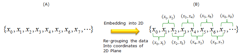
Check one label in the diagram above. The last group on the top row is marked (x8, x9), but its bracket starts at x7. Following the pattern of the other labels, it is (x7, x8).
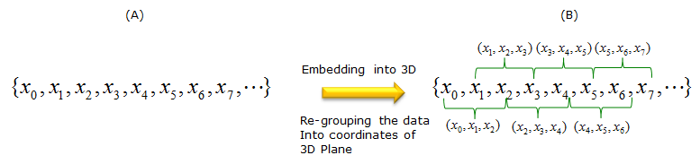
You can also embed as follows as well. In this case, '1-D' data is transformed (embedded) into '3-D' data.
There is no single/fixed method for embedding. You can embed the data in any way that would give you the best information. For example, even in case of 1D to 2D embedding, you can group the data as follows. (Compare this to the first case). Again, this is not the only way, you can group the data in anyway as long as it gives you any meaningful result.
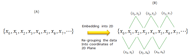
All three cases follow one pattern. Each point is a delay vector (xn, xn+τ, ..., xn+(m-1)τ). The embedding dimension m is the number of coordinates in one point. The delay τ is the step between two coordinates. The table below lists the two values for each case above.
Case |
m |
τ |
First points |
1 |
2 |
1 |
(x0, x1), (x1, x2), (x2, x3), ... |
2 |
3 |
1 |
(x0, x1, x2), (x1, x2, x3), (x2, x3, x4), ... |
3 |
2 |
2 |
(x0, x2), (x1, x3), (x2, x4), ... |
In all three cases the groups overlap, so a list of N numbers gives N - (m-1)τ points. For example, 400 numbers give 399 points in Case 1 and 398 points in Case 3. Overlapping groups are the usual choice, because they keep one point for almost every time step.
Two numbers define an embedding : the dimension m and the delay τ. Once you fix them, the points follow from the data with no further choice.Each coordinate is the same signal at a different time : the axes of an embedded plot are xn, xn+τ and so on, not different physical quantities.A larger τ spreads the points out in time : Case 3 compares each value with the one two steps later instead of the very next one.
Why does embedding show structure the raw data hides ?
A plot of xn against n shows every value, but it hides how each value depends on the one before it. Embedding puts consecutive values side by side, so that dependence becomes a shape you can see. Let's look at an example where the raw plot looks random and the embedded plot does not.
Now you would have an important question. Why do we use this kind of method ?
The answer is simple. It is because the embedded result would give you better / clear information (view) than the original data. Of course, you may come out with even more confusing result than the original data, but those embedding will be rejected by others (rejected even by yourself).
Following is one example. The graph on the left side is the plotting of an original data (the data before embedding). If you want to know how you get this data, see Logistics page. (B) is the result of Embedding based on < Case 1 > described above. I would not go into mathmetical details of this process, but you would see intuitively that (B) gives you much more clear understanding of the data comparing to graph (A).
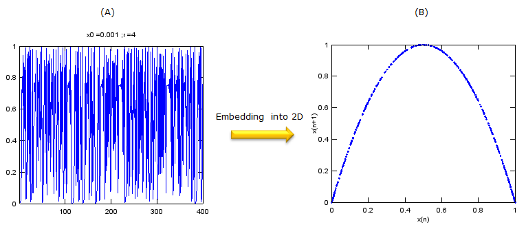
The parabola in plot (B) is not a coincidence. The data in plot (A) comes from the logistic map xn+1 = 4 xn(1 - xn). So every embedded point (xn, xn+1) must lie on the curve y = 4x(1 - x). The embedding does not add information. It shows the rule that produced the data, which the time plot spreads across 400 separate steps.
You might expect ordinary statistics to find the same rule. They don't. The correlation between xn and xn+1 for these 400 values is only about -0.02, because the parabola rises on one half and falls on the other. A straight-line fit through plot (B) is flat. So the dependence is strong, but it is nonlinear, and only the embedded plot shows it.
The diagram below is a direct test. The left plot embeds 401 values of the logistic map with r = 4 in their original order, starting from x0 = 0.001. The right plot embeds exactly the same 401 values after a random shuffle. Both lists have the same values and the same histogram. Only the order differs.
Figure 1. The shape in an embedded plot comes from the order of the data, not from its values. In time order the points fall on one curve. After a shuffle they fill the whole square.
- The left plot repeats plot (B) above with a different number of points. Every point sits on the curve y = 4x(1 - x).
- The right plot has no visible structure. After a shuffle, xn+1 no longer depends on xn.
- Both plots have more points near 0 and 1 than near 0.5. This comes from the value distribution of the logistic map at r = 4, and a shuffle does not change it.
Real data rarely comes from a one-step rule like this, so you usually need more than two dimensions. Takens' embedding theorem gives the guideline. Suppose the system moves on an attractor of dimension d. Then delay vectors with m > 2d reproduce that attractor, up to a smooth change of coordinates, for almost any choice of τ. In practice, you increase m until the shape of the embedded plot stops changing.
A deterministic rule becomes a thin shape : when xn+1 depends only on xn, the 2D embedding is the graph of that dependence.Noise fills the space : random data, or shuffled data, spreads over the whole plot. The contrast between the two is the basic test for hidden structure.Correlation is not enough : the logistic data has almost zero correlation between neighbours, yet each value fixes the next one exactly.
Example 01 : EKG Analysis
This is one example of using embedding technique (this is '1D' to '3D' embedding) which can be used in real engineering. You would see a 3D graph as the result of the process. You may not see a clear meaning of the resulting 3D graph, but there are some additional mathematical technique to extract more clearer meaning from the resulting embedded graph. I will post another pages about this additional mathematical technique when I find time.
Following is from CHAOS ANALYSIS FOR EKG TIME SERIES DATA by Chetan Mehta, Matthew Miller
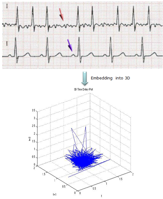
In the 3D time delay plot above, each point uses three consecutive samples of the EKG voltage. The axes are labelled t, t+1 and t+2, so this is an embedding with m = 3 and τ = 1, like Case 2. Most points form a dense bundle at low values. A few long lines leave the bundle and reach up to about 3 on the t+2 axis. Unlike the logistic example, the shape is not a thin curve. This is why further techniques are needed before the plot gives a clear result.