In this section, I would like to introduce you to the logistic equation - one of the most iconic and widely studied equations in the field of Chaos theory. Originally formulated as a simple model to describe population growth, the logistic equation gained immense significance when researchers discovered its surprising and complex behavior under certain conditions. As the equation's parameter is varied, its solutions exhibit a rich tapestry of dynamics - from stable fixed points to periodic oscillations, and eventually to chaotic regimes. This seemingly simple nonlinear equation not only served as a foundational example of how deterministic systems can behave unpredictably but also acted as one of the most powerful catalysts in the early development of Chaos theory. Its ability to demonstrate how order can emerge, break down, and give rise to intricate patterns continues to captivate mathematicians, physicists, and scientists across disciplines.
The page has three parts. First, a simulator lets you move r and watch three plots change together. Next, the section on how it works builds the same pictures step by step, with the Matlab/Octave code behind them. The last section puts numbers on the diagram: where each bifurcation happens, and how to tell chaos from a long cycle.
Building Up Intuition
Understanding the behavior of nonlinear systems like the logistic map requires more than just equations - it demands intuition. Visual tools such as time series plots, embedded phase space representations, and bifurcation diagrams help translate abstract mathematical behavior into something tangible and interpretable. By engaging with these dynamic visualizations, we begin to see patterns, recognize transitions, and internalize how simple rules can generate complex outcomes. Building such intuition is crucial not only for grasping the fundamentals of Chaos theory but also for appreciating how deterministic systems can lead to unpredictable and richly structured behavior. It transforms the logistic equation from a static formula into a living system that responds vividly to parameter changes, revealing the delicate interplay between stability and chaos.
Features
The simulator draws three views of the same equation at once. The time series and the embedded plot show one value of r. The bifurcation diagram shows every r from 2.0 to 4.0, so you can see where the current r sits in the larger picture.
- Time Series Plot: Visualizes the evolution of values over iterations (
NOTE : You can Zoom and Pan this plot with Mouse. Zoom with Mouse Rolling, Pan with Mouse Drag) - Embedded Plot: Shows the relationship between consecutive values (x[n] vs x[n+1])
- Bifurcation Diagram: Displays the long-term behavior across different r values
- Interactive Controls: Real-time parameter adjustment and visualization
- Multiple Presets: Quick access to different behavioral regimes
Basic Controls
Only two inputs change the mathematics: r and the initial value x0. The other controls change how much you compute and how it is drawn. A change to r, x0 or the iteration count recomputes the sequence at once, and the Plot button recomputes it on demand.
- r Value (2.0 - 4.0)
- Adjust using the slider
- Click directly on the bifurcation diagram to set r value
- Controls the growth rate parameter of the logistic map
- Initial x0 (0 - 1)
- Set the starting value
- Default is 0.5
- Iterations
- Number of iterations to compute
- Default is 1000
- More iterations provide better resolution for chaotic behavior
- Update Rate
- Controls animation speed in milliseconds (NOTE : Almost of no use for this program)
- Default is 32ms
- Show Grid
- Toggle grid overlay on all plots
- Helps with value reading
- Color Scheme
- Default: Blue gradient
- Options include rainbow, heat, and cool color schemes
Presets
The three presets are one example from each type of long-run behavior. Compare them with the bifurcation diagram: r = 2.8 sits on the single branch, r = 3.2 sits between the first two splits, and r = 3.9 sits inside the chaotic cloud.
- Stable: r = 2.8 (converges to a single point)
- Periodic: r = 3.2 (oscillates between values)
- Chaos: r = 3.9 (exhibits chaotic behavior)
Understanding the Plots
Each plot answers a different question about the same sequence. The time series shows the order of the values. The embedded plot shows how each value depends on the one before it. The bifurcation diagram shows which values remain after the start-up transient, for every r at once. Its data uses x0 = 0.5, discards the first 100 iterations, and keeps the next 100 for each r.
- Time Series Plot
- X-axis: Iteration number
- Y-axis: Value (0 to 1)
- Shows how values change over time
- Embedded Plot
- X-axis: Current value (x[n])
- Y-axis: Next value (x[n+1])
- Parabola shows the mapping function
- Points show the actual trajectory
- Bifurcation Diagram
- X-axis: r value (2.0 to 4.0)
- Y-axis: Long-term values (0 to 1)
- Shows period doubling and chaos
- Red vertical line indicates current r value
How it works ?
Let's start with intuition. Look at the following graph. How does it look like ? Does it look simple or complex ? The graph is a time series of 200 values. Before you read on, guess how complicated the rule behind it must be, because the equation that follows is much shorter than most people expect.
Does it look like it is based on a simple rule (function) or based on a very complicated rule ? Do you think you can even draw this graph with any mathematicaly equation ? Doesn't it look like simple random sequence of numbers ?
My first impression when I first studied Chaos theory was "It may not be completely random sequence ? (If it is the case, I would not see this on textbook :)), but I would at least need pretty complicated equation (function) to draw this.". What is your thought ?
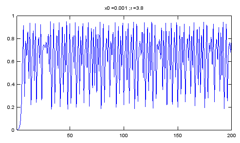
Now here goes the equation to draw this plot. What is the first impression ? Even though the expression looks a little bit different from what you learned from what you learned in high school, isn't it enough to give you the impression that it looks much simpler than you expected. Usually our expectation (or prejudice) would be 'you would need a simple function to draw a simple graph and would need a complicated function to draw a complicated graph'. (The graph in this context can represent a natural phonemina in real life). If you were asked to come up with any function to draw the graph as shown above, you would say 'I would give up.. I not sure if there is any equation for this.. if any, it would be extremely complicated'. This graph is based on a simple rule stated as follows. (What is meaning of this equation and how to calculate the values for each point, refer to 'Recursive/Iterative Function' page).
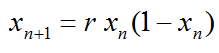
If you want to play with this equation with Matlab or Octave, try with following code.
N = 200;
r = 3.8;
x0 = 0.001;

x = zeros(1,N);
x(1) = x0;

for n = 1:N-1
    x(n+1) = r .* x(n) .* (1.0 - x(n));
end;

plot(x);xlim([1 N]);ylim([0 1]);title(strcat('x0 = ',num2str(x0),' ; ','r = ',num2str(r)));
This is one of the key idea of Chaos.. "Even a very complicated phenomina (at least apparently very complicated one) can be described by very simple rule". With Chaos theory, a lot of real life problems (engineering, physics, biolology etc) which used to be taken as a area that cannot be desribed by mathematical way since it is too complicated now became a part of formal/mathematical research and application.
Now let's look at another intuitive aspect of the Chaos phenomena. Look at the following for graph (A),(B),(C),(D).
What do you think ?
My impression is ..
- (A) looks simple.. and I think I can come up with some simple equation to draw this.
- (B) looks a little bit complicated comparing to (A), but I think I can come up with some equation if I try hard.
- (C) looks more complicated comparing to (B) and very complicated comparing to (A). I am not sure if I can figure out any equation to draw this plot.
- (D) ? I would give up ! it looks beyond my understanding.
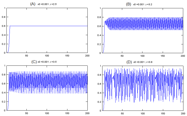
Here goes 'Surprise'. All of these graph are from the same equation as below. (Yes.. it is the equation that I explained above).
All of the above graphs came from this same equation. The only difference among these graph is the value of 'r' in the equation.
Here goes another important properties of Chaos model.
With Chaos model, there are many cases where many of drastically different looking phenomena can be described (explained) by a same rule (function).
Now a question would pop up in your mind. Is there only four different types of graph for this equation ? Definately Not. Even though you haven't calculated the values on your own, you would get the intuition that you would have different patterns of the graph which is different from the four examples shown above.
If you want to know the graph for various different 'r' value, you can draw a couple of hundred graph with different 'r' values as shown above. For example, you can draw 301 separate graphs for 2.5 <= r <= 4.0 with r being incremented by 0.005.
You can draw the several hundred graph one by one on different paper, but with all those separate graph it would be a little tricky to compare those graphs and find any patterns from the hundreds of graph.
Would there be any way to combine all of the hundreds of graph onto single coordinate system (on a single graph) ?
One of the common method for combining all of the individual plot is to draw a graph as shown below.
You may not be exactly sure what is the meaning of this graph.. or how to explain this graph.. at least you may feel 'It looks nice.. it looks like a broomstick (Good interpretation :)). At least, I think I see some pattern even though I don't know how to describe the pattern in my own words'.
It is good enough for now if you have this kind of impression.
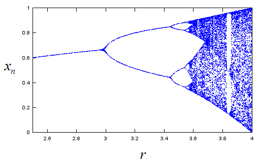
Following is Matlab/Octave code that I used to draw the plot shown above.
N = 200;
x0 = 0.001;

for r = 2.5:0.005:4.0

    x = zeros(1,N);
    x(1) = x0;

    for n = 1:N-1
        x(n+1) = r .* x(n) .* (1.0 - x(n));
    end;

    xstate = x(100:N);
    rval = xstate;
    rval(:) = r;

    plot(rval,xstate,'bo','MarkerSize',1);xlim([2.5 4.0]);ylim([0 1]);hold on;

end;
Now you would have more serious question. What is the meaning of the plot shown above. Exactly how you can draw the plot. I don't think I can describe the details in words without confusing you and confusing myself. In stead I tried to exaplain it in illustration as shown below. Give sometime and think on your own, I think you can grasp the meaning.
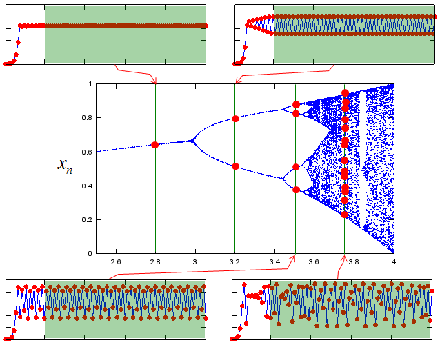
The graph shown above is a good technique to find a pattern from many graphs from a same equation (we call this graph as 'bifurcation graph'. 'Bifurcation' means 'Branching into two segment'. If you closely look at the plot, you may find some places where the graph branch into two path (bifurcate), that's why we call it 'bifurcation' plot)
There are another techniques that would help you find some pattern from a single graph. One example is shown below.
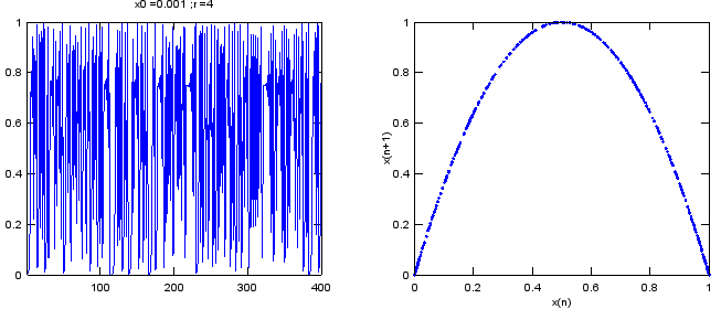
Do you see any similarity between the left and right graph ? Can you imagine that these two graph is from the exactly the same data ?
Believe it or not. These two graph are from the same data sequence. but you may think it would look almost random data or very complicated data on the left side graph, but you would see pretty clear pattern on the right side graph.
The right side graph is drawn by a special technique called 'Embedding'. Refer to Embbeding page for the detailed explanation of the technique.
Where exactly does the order break down ?
The bifurcation diagram shows where the branches split, but only by eye. Now let's put numbers on those splits. The numbers also answer a practical question: when a plot looks irregular, is it chaos or only a long cycle? A cycle of period 64 and a chaotic sequence can look the same in a short time series.
Start with the first split. The equation has a fixed point at x* = 1 - 1/r, where xn+1 = xn. The slope of r x (1 - x) at that point is 2 - r. The fixed point is stable while this slope stays between -1 and 1, which means 1 < r < 3. At r = 3 the slope reaches -1, and the single branch splits into a cycle of period 2. The Recursive/Iterative Function page explains this slope test in more detail.
Each later split happens the same way, but for the cycle rather than the fixed point. The table below lists the first splits. The values come from solving for the r at which each cycle loses its stability.
Split |
r |
What changes |
Width of the r range before this split |
1 |
3 |
Fixed point becomes period 2 |
- |
2 |
3.449490 = 1 + √6 |
Period 2 becomes period 4 |
0.449490 |
3 |
3.544090 |
Period 4 becomes period 8 |
0.094600 |
4 |
3.564407 |
Period 8 becomes period 16 |
0.020317 |
5 |
3.568759 |
Period 16 becomes period 32 |
0.004352 |
Limit |
3.569946 |
Infinitely many splits. Chaos starts after this point |
- |
Look at the last column. Each r range is about 4.7 times narrower than the one before it. The ratios are 4.75, 4.66 and 4.67, and they approach the Feigenbaum constant δ = 4.669... The same ratio appears in every smooth map with a single rounded hump, not only in this equation. That is why the splits crowd together so quickly near r = 3.57 in the bifurcation diagram.
Beyond r = 3.57 the diagram is mostly a cloud, but it contains white gaps. The widest one starts at r = 1 + √8 = 3.8284. Inside it, the sequence settles into a cycle of period 3. For example, at r = 3.83 it repeats 0.1561, 0.5047, 0.9574. You can see this gap as the white vertical band near r = 3.83 in the bifurcation plot above.
To separate chaos from a cycle, measure how fast two nearby sequences move apart. The Lyapunov exponent is the average of ln|r (1 - 2xn)| over a long run. A negative value means nearby sequences converge, so the sequence has settled to a fixed point or a cycle. A positive value means they separate at every step, which is chaos. The diagram below plots this exponent for 2.5 <= r <= 4.0, with x0 = 0.001, 1000 transient steps and 3000 averaged steps.
Figure 1. Lyapunov exponent of the logistic equation. It touches 0 at each split and stays negative while the sequence is periodic. It becomes positive only after r = 3.57, and it drops below 0 again inside the periodic windows.
- At r = 2.5 and r = 2.8 the exponent is ln|2 - r|, which is -0.693 and -0.223. This is the slope test for the fixed point, written as a logarithm.
- The curve rises to 0 at r = 3 and at r = 3.449, exactly at the first two splits in the table. Values below -2 are cut off at the bottom of the plot.
- The sharp downward spikes above r = 3.57 are periodic windows. The largest one begins at r = 3.828, the period-3 window.
- At r = 3.8 the exponent is about 0.43, and at r = 4 it reaches ln 2 = 0.693, its largest value on this range.
One warning applies to the simulator at the top of the page. Its default starting value is x0 = 0.5. At r = 4 this start gives x1 = 1 and x2 = 0, and the sequence then stays at 0 forever. So the plot at r = 4.000 shows a flat line, not chaos. Change x0 to any other value, such as 0.3, to see the chaotic sequence.
The splits follow a fixed ratio : the r ranges between splits shrink by about 4.669 each time. This is why infinitely many splits fit below r = 3.57.Chaos does not fill the whole range above 3.57 : periodic windows, such as the period-3 window at r = 3.828, sit between chaotic regions.The Lyapunov exponent separates the two cases : negative means a fixed point or a cycle, and positive means chaos. A time series plot alone cannot always tell them apart.