Probably Fourier Transform would be a mathematical tool which is the most widely used in engineer area. I would not explain in details how Fourier Transform works mathematically, you can have a lot of information from internet or at least you would go through at least a couple of month for this topic during your university course.
When I think about the word "Fourier" (Actually a person's name), I have two images as shown below. One is a Fourier Series Expension and the other one is Fourier Transform. With Fourier Series expansion, you would have a continous function made up of very simple components (sin() + cos()) for any data whether the data is continous or non-continous. I am pretty sure that you would learn how to create a sequence of (sin() + cos()) to approximate computer clock-like rectangular pulse. (You could easily find tutorial or even many of Java application from internet).
Another image that pops up in my mind when I think about 'Fourier' is 'Fourier Transform'. One of the most typical usage (or purpose) of Fourier transform is to convert a time domain data into a frequency domain data and this section will mostly focused on this 'Fourier Transform'. (I think I am hearing those questions from many reader... saying ... "What is time domain data ? What is frequecy domain data ? why we want to convert the time domain data into frequency domain data ?". All of these are very good question. Try very hard until you get your own answers for these questions -:)).
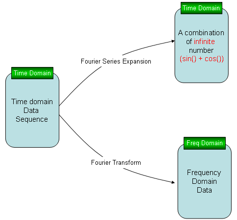
A Fourier series rebuilds the data in the time domain from sin() and cos() terms, while a Fourier transform moves the data into the frequency domain.
Both paths start from the same time domain data : the upper path keeps the result in the time domain, as a sum of sin() and cos() terms. The lower path produces a new set of numbers, one for each frequency.The DFT is the version for sampled data : a computer holds N samples, not a continuous function. The DFT takes those N samples and returns N frequency values.The FFT is a fast way to compute the DFT : it gives the same result as the DFT formula, but it needs about N log2N operations instead of N2. For N = 1024 that is about 10,000 operations instead of about one million.
I would not explain much of the theory about FFT, you would already get too much of it from text book or from on-line. As in other pages in my site, I will put as much examples and plots as possible just to make you "feel" about it. Of course, this pages would keep being extended as I find more examples that would help you with "intuitive" understanding of FFT.
- What is Fourier Transform ?
- Common Example of Fourier Transform
- Example 01 - Cos(x)
- Example 02 - Exp(j w x)
- Example 03 - Rectangular Wave
- Example 04 - Rectangular Wave with DC offset
- Example 05 - Truncated Rectangular Wave
- Example 06 - Truncated Cos(x)
- Example 07 - Sinc(x) - Low Pass Filter
- Example 08 - Sinc(x) - Band Pass Filter
- Zero Padding
- Number of Period
- Abrupt Changes in Time Domain Data
- FFT for Complex Number
- Phase of FFT
- Effect of multiplying Exp(p i) to the signal
- Effect of Multiplying Exp(f t i) to the signal
- Reference
What is Fourier Transform ?
Fourier Transform is a special kinds of mathematical series technology that can approximate a function or a data with summation of sin() and cos() function. There are two kind of Fourier transform, one is continuous fourier transform and the other is discrete fourier transform.
Basic principles are same, but in this section I will explain the concept of Fourier transform using a discrete transform since it is easy to visualize and less scary :)
A typical mathematical presentation of Discrete Fourier Transform looks as follows. It may look a little bit complicated, but if you wrap it up into proper chunks you would notice that this is also a kind of "Sum of Times" format.
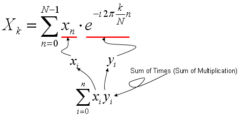
As you learned in Correlation section (explained above), the most intuitive meaning of "Sum of Times" is a kind of indicator showing the correlation between two data sequences.
So Fourier Transform is also based on calculating the two specified data sequence as follows.
xi = input data sequence for Fourier Transform
yi = e^(-i 2pi k n/N)
It means that Fourier Transform is indication of correlation between a given data sequence and "e^(-i 2pi k n/N)". If you studied "Exponential Form" or any material about Euler's formula, you would know e^(-i 2pi k n/N) is a cyclic function. It is a cyclic function, the cycle of which is represented by the variable 'k'. Therefore, we can say "Fourier Transform is a tool to show the correlation between a specified data sequence and muliples of cyclic data sequence with different cycle".
If I represent my explanation, Fourier Transform can depicted as follows. (In the following graph, "x1" is the input data you want to do 'fourier transform', and the series of plots on right side is the multiple cyclic data sequence with different cycles. The stem plot at the left bottom is the graph shows the forrelation coefficient of each data pair, i.e (x1, s1), (x1,s2), (x1, s3) and so forth.
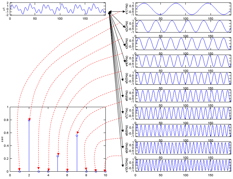
Each stem is the correlation between x1 and one sine wave, so only the frequencies present in x1 give a stem.
Three stems for three components : x1 contains 2 Hz, 5 Hz and 7 Hz with amplitudes 1, 0.3 and 0.7. The stems at 2, 5 and 7 are about 0.80, 0.24 and 0.56, and every other stem is 0.The stem heights follow the amplitudes : each correlation coefficient equals the amplitude divided by sqrt(12 + 0.32 + 0.72), about 1.26. So the ratio between the stems is the same as the ratio between the amplitudes.A sine probe misses a cosine : the script correlates x1 with sine waves only. A component written as cos(2πft) gives almost no correlation with sin(2πft). The DFT avoids this problem with the complex probe e-i2πkn/N, whose real part is a cosine and whose imaginary part is a sine.
If you convert this description into a mathematical forumula, Fourier Transform can be depicted as follows.
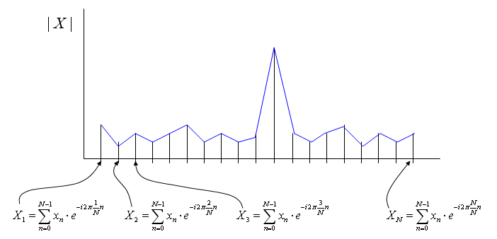
The DFT repeats the same sum of products for every k, and the magnitude of each result is one point of the spectrum.
The index runs from 0 to N-1 : the labels in the diagram start at X1 and end at XN. In the formula, k runs from 0 to N-1, so XN would be the same value as X0, the DC term.Each Xk is a complex number : the diagram shows |X|, the magnitude. The phase of each Xk is the subject of the Phase of FFT section.
Following is Matlab/Octave script generating the sequence of graphs shown above. Try change the data for x1 in various different way until you get your own intuition of this concept.
t=0:2*pi/400:3;
Nt = size(t,2);
x1 = sin(2*pi*2*t) + 0.3 * sin(2*pi*5*t) + 0.7*sin(2*pi*7*t);
s1=sin(2*pi*1*t);
s2=sin(2*pi*2*t);
s3=sin(2*pi*3*t);
s4=sin(2*pi*4*t);
s5=sin(2*pi*5*t);
s6=sin(2*pi*6*t);
s7=sin(2*pi*7*t);
s8=sin(2*pi*8*t);
s9=sin(2*pi*9*t);
s10=sin(2*pi*10*t);
corr_vec = [corrcoef(x1,s1) corrcoef(x1,s2) corrcoef(x1,s3) corrcoef(x1,s4) corrcoef(x1,s5) corrcoef(x1,s6) corrcoef(x1,s7) corrcoef(x1,s8) corrcoef(x1,s9) corrcoef(x1,s10)];

subplot(10,2,1);plot(x1);ylabel('x1');axis([0,Nt,-2.1,2.1]);

subplot(10,2,1*2);plot(s1);ylabel('s1(1Hz)');axis([0,Nt,-1.1,1.1]);
subplot(10,2,2*2);plot(s2);ylabel('s2(2Hz)');axis([0,Nt,-1.1,1.1]);
subplot(10,2,3*2);plot(s3);ylabel('s3(3Hz)');axis([0,Nt,-1.1,1.1]);
subplot(10,2,4*2);plot(s4);ylabel('s4(4Hz)');axis([0,Nt,-1.1,1.1]);
subplot(10,2,5*2);plot(s5);ylabel('s5(5Hz)');axis([0,Nt,-1.1,1.1]);
subplot(10,2,6*2);plot(s6);ylabel('s6(6Hz)');axis([0,Nt,-1.1,1.1]);
subplot(10,2,7*2);plot(s7);ylabel('s7(7Hz)');axis([0,Nt,-1.1,1.1]);
subplot(10,2,8*2);plot(s8);ylabel('s8(8Hz)');axis([0,Nt,-1.1,1.1]);
subplot(10,2,9*2);plot(s9);ylabel('s9(9Hz)');axis([0,Nt,-1.1,1.1]);
subplot(10,2,10*2);plot(s10);ylabel('s10(10Hz)');axis([0,Nt,-1.1,1.1]);
subplot(10,2,[13 15 17 19]);stem(abs(corr_vec));ylabel('corr');axis([0,10,0,1.0]);
Common Example of Fourier Transform
Followings are some of the common examples of Fourier Transform that you may often see in engineering math textbook. These examples are from my visual note (www.slide4math.com). The concept shown in these example is basically same as what I explained in previous section, but this visualization shows more strictly on Fourier Transform formula with complex numbers.
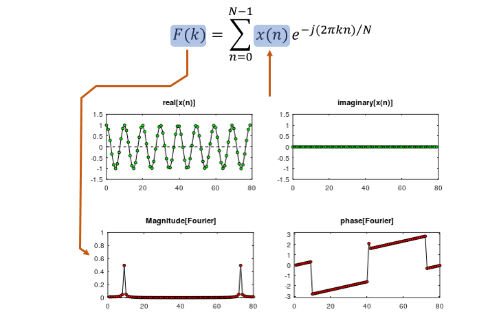
Example 01 - Cos(x)
A cosine is the simplest real signal. The magnitude plot shows two peaks of 0.5, one near k and one near N - k, because cos θ = (ejθ + e-jθ)/2. The magnitude in these plots is divided by N, and the imaginary part of the input is zero.
Click on the image or here to see the animation.
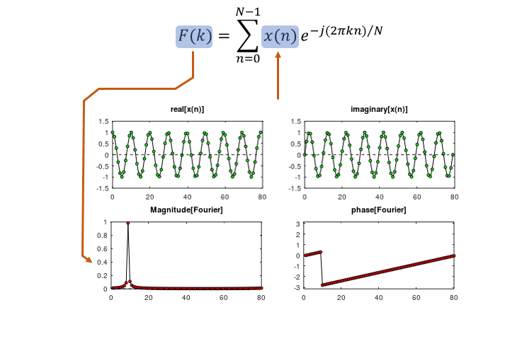
Example 02 - Exp(j w x)
Here the real part is a cosine and the imaginary part is a sine of the same frequency, so the input is a complex exponential. The two halves of the cosine now add at one frequency. The magnitude plot shows a single peak of 1, with no mirror peak near N.
Click on the image or here to see the animation.
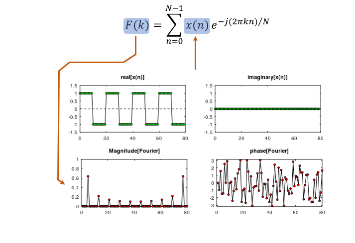
Example 03 - Rectangular Wave
A square wave between +1 and -1 contains only odd harmonics. The peaks sit at 1, 3, 5 and more times the base frequency, and their heights are about 0.64, 0.22 and 0.14. A continuous square wave gives 2/(πm), that is 0.64, 0.21 and 0.13, so the sampled wave is a little higher at the upper harmonics.
Click on the image or here to see the animation.
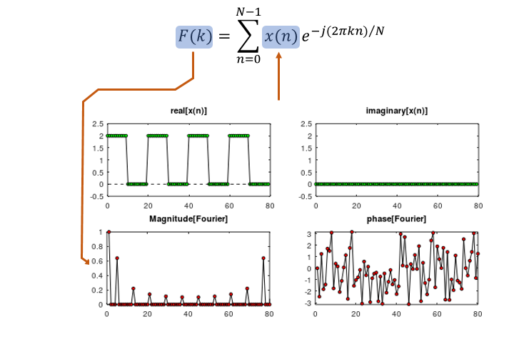
Example 04 - Rectangular Wave with DC offset
Adding a DC offset of 1 turns the wave into one that switches between 0 and 2. Only the value at k = 0 changes. It becomes 1, the average of the signal, and every harmonic keeps the height it had in Example 03.
Click on the image or here to see the animation.
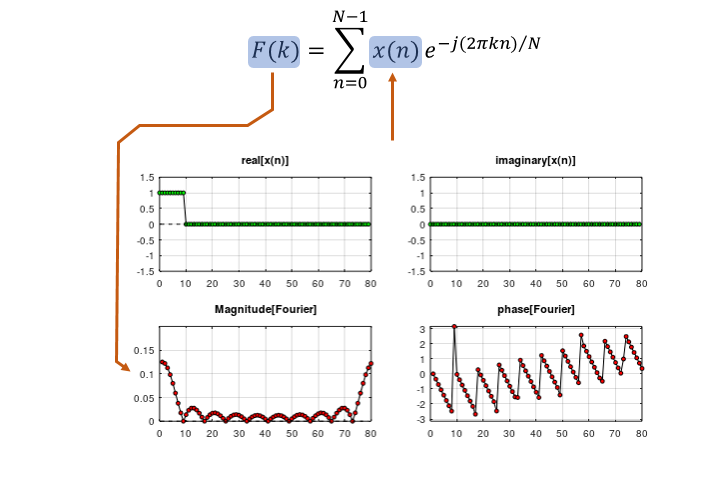
Example 05 - Truncated Rectangular Wave
A single pulse of 10 samples inside 80 samples gives a sinc-shaped magnitude. The peak at k = 0 is 10/80 = 0.125, and the zeros repeat every 80/10 = 8 bins. A shorter pulse would give wider lobes.
Click on the image or here to see the animation.
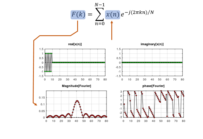
Example 06 - Truncated Cos(x)
The same window of 10 samples now holds an alternating signal, +1, -1, +1 and so on. That is a cosine at half the sampling rate. The sinc shape of Example 05 moves to the centre, k = 40, and keeps its peak of 0.125.
Click on the image or here to see the animation.
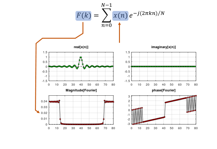
Example 07 - Sinc(x) - Low Pass Filter
This example reverses the roles of time and frequency. The input is a sinc pulse centred at n = 40, and its magnitude is flat for small k and for k close to N, and nearly zero between them. That flat band around k = 0 is the response of an ideal low pass filter, so the sinc is the impulse response of that filter.
Click on the image or here to see the animation.
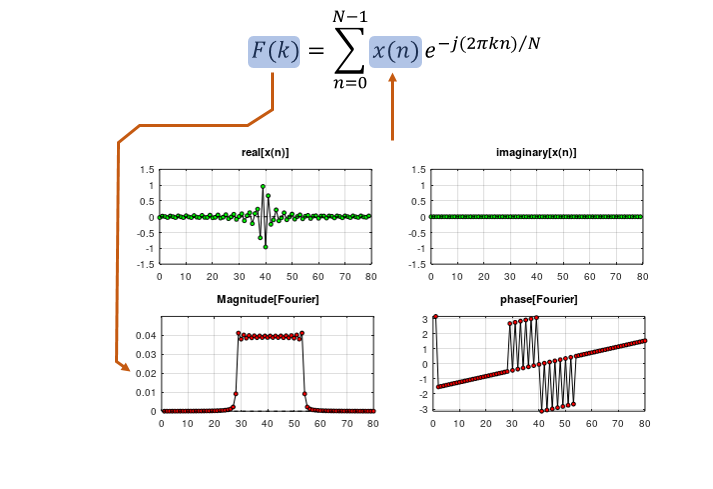
Example 08 - Sinc(x) - Band Pass Filter
Here the sinc samples also change sign from one sample to the next. This multiplies the sinc by (-1)n, a cosine at half the sampling rate. The flat band moves from k = 0 to the centre, k = 40, and the low pass filter becomes a band pass filter.
Click on the image or here to see the animation.
Zero Padding
See following plots. As you see in (a), (b), (c), (d), the length of the data for the signal are all the same. But length of zero value being appended to the signal data are different resulting in different number of data for fft. Just try to 'feel' or 'sense' the general trand. what kind of difference you see in the fft plot as the length of appended zero gets increased ? Do you see the fft plot gets smoother as the length of trailing zeros (zero pad) gets longer ?
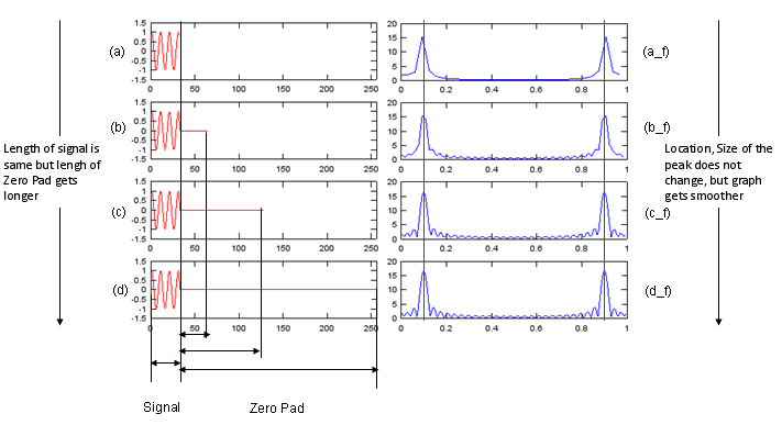
Zero padding adds points between the existing frequency bins, so the curve gets smoother, but the peak keeps its width.
The bin spacing is 1/L : with L = 32, 64, 128 and 256 points, the FFT samples the spectrum every 0.031, 0.016, 0.0078 and 0.0039 cycles per sample. The x-axis of each FFT plot is normalized frequency, from 0 to 1.The peak is near 0.1 and about 16 high : the signal cos(2πn/10) has 0.1 cycles per sample, and its 32 samples give a peak close to 32/2 = 16. With 32 points no bin falls on 0.1, so the plot shows about 15.4 at 0.094. With 128 or 256 points it shows about 16.6 near 0.102.Zero padding does not improve resolution : the width of the peak depends on the 32 samples of real data, not on the zeros. Two tones closer than about 1/32 cycles per sample stay merged, however many zeros you add. The next section shows what more signal does to the width.The second peak is the mirror image : the peak near 0.9 is the negative frequency -0.1. The FFT output runs from 0 to 1, so -0.1 appears at 1 - 0.1. A real input always gives this mirror.
Try following Octave/Matlab code and play with following lines marked in blue.
n = [0:31];
x = cos(2*pi*n/10);

x1 = x;
x2 = [x zeros(1,64-length(x1))];
x3 = [x zeros(1,128-length(x1))];
x4 = [x zeros(1,256-length(x1))];

fft_x1 = abs(fft(x1));
fft_x2 = abs(fft(x2));
fft_x3 = abs(fft(x3));
fft_x4 = abs(fft(x4));

f1 = [0:length(fft_x1)-1]/length(fft_x1);
f2 = [0:length(fft_x2)-1]/length(fft_x2);
f3 = [0:length(fft_x3)-1]/length(fft_x3);
f4 = [0:length(fft_x4)-1]/length(fft_x4);

subplot(4,2,1);
plot(x1,'r-'); axis([0 length(x4) -1.5 1.5]);
subplot(4,2,2);
plot(f1,fft_x1);

subplot(4,2,3);
plot(x2,'r-'); axis([0 length(x4) -1.5 1.5]);
subplot(4,2,4);
plot(f2,fft_x2);

subplot(4,2,5);
plot(x3,'r-'); axis([0 length(x4) -1.5 1.5]);
subplot(4,2,6);
plot(f3,fft_x3);

subplot(4,2,7);
plot(x4,'r-'); axis([0 length(x4) -1.5 1.5]);
subplot(4,2,8);
plot(f4,fft_x4);
Number of Period
See following plots. As you see in (a), (b), (c), (d), the total of the fft data (signal + zero padding) are all the same. But the number of cycles of the signal are different. Just try to 'feel' or 'sense' the general trand. what kind of difference you see in the fft plot as the number of signal cycles gets increased ? Do you see the peak gets higher and sharper as the number of signal cycles gets larger ?
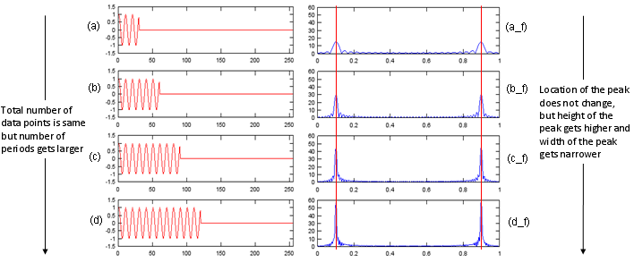
More periods of the signal give a taller and narrower peak at the same frequency.
The peak grows with the signal length : each block holds 30 samples, which is 3 periods. The peak is about 15, 30, 44 and 57 for 1, 2, 3 and 4 blocks, close to half the number of signal samples.The peak narrows at the same rate : the main lobe is about 2/M wide for M signal samples. So it shrinks from about 0.067 to about 0.017 as M goes from 30 to 120. This is real frequency resolution, unlike the zero padding in the previous section.The total length stays at 256 : the bin spacing is the same in all four plots, so only the signal content changes.
Try following Octave/Matlab code and play with following lines marked in blue.
n = [0:29];
x = cos(2*pi*n/10);

x1 = [x zeros(1,256-1*length(x))];
x2 = [x x zeros(1,256-2*length(x))];
x3 = [x x x zeros(1,256-3*length(x))];
x4 = [x x x x zeros(1,256-4*length(x))];

fft_x1 = abs(fft(x1));
fft_x2 = abs(fft(x2));
fft_x3 = abs(fft(x3));
fft_x4 = abs(fft(x4));

f1 = [0:length(fft_x1)-1]/length(fft_x1);
f2 = [0:length(fft_x2)-1]/length(fft_x2);
f3 = [0:length(fft_x3)-1]/length(fft_x3);
f4 = [0:length(fft_x4)-1]/length(fft_x4);

subplot(4,2,1);
plot(x1,'r-'); axis([0 length(x4) -1.5 1.5]);
subplot(4,2,2);
plot(f1,fft_x1); axis([0 1 0 60]);

subplot(4,2,3);
plot(x2,'r-'); axis([0 length(x4) -1.5 1.5]);
subplot(4,2,4);
plot(f2,fft_x2); axis([0 1 0 60]);

subplot(4,2,5);
plot(x3,'r-'); axis([0 length(x4) -1.5 1.5]);
subplot(4,2,6);
plot(f3,fft_x3); axis([0 1 0 60]);

subplot(4,2,7);
plot(x4,'r-'); axis([0 length(x4) -1.5 1.5]);
subplot(4,2,8);
plot(f4,fft_x4); axis([0 1 0 60]);
Abrupt Changes in Time Domain Data
See following plots. As you see in (a), (b), (c), (d), the total of the fft data (signal + zero padding) are all the same. But the number of cycles of the signal are also same. Then what is the difference ?
Comparing (a) and (b), you would notice a sudden phase change in the middle of the signal (b). This abrupt change created the distortion in fft as shown in (b_f).
Comparing (a) and (c), you would notice (c) is rectangular form of signal meaning that there are abrupt amplitude changes at rising and falling edges of the pulses. But in this case, this abrupt change does not create any distortion in fft plot. In stead, it creates a couple of additional peaks in fft (c_f). If you study only a little bit of Fourier Series, you would understand why these additional peaks show up.
Comparing (c) and (d), you would notice a sudden phase change in the middle of the signal (d). This abrupt change created the distortion in fft as shown in (d_f).
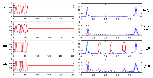
A phase jump splits the peak, while the edges of a square wave add harmonics.
A phase jump splits the peak : in (b) the second block is -x, so the signal is x multiplied by a step from +1 to -1. The two halves cancel at 0.1, and the peak splits into two peaks, about 20 and 23 high, near 0.09 and 0.11.Square wave edges create harmonics : in (c) the main peak is about 39, higher than the 30 of (a). A square wave of amplitude 1 has a fundamental of amplitude 4/π, about 1.27. The peaks at 0.3 and 0.5 are the 3rd and 5th harmonics.The peak at 0.7 is a mirror : the plot runs from 0 to 1, and a real signal is symmetric about 0.5. So the peak at 0.7 is the mirror of the 3rd harmonic at 0.3.(d) combines both effects : the harmonics of the square wave and the split main peak appear together.
Try following Octave/Matlab code and play with following lines marked in blue.
n = [0:29];
x = cos(2*pi*n/10);

x1 = [x x zeros(1,256-2*length(x))];
x2 = [x -x zeros(1,256-2*length(x))];
x3 = [sign(x) sign(x) zeros(1,256-2*length(x))];
x4 = [sign(x) -sign(x) zeros(1,256-2*length(x))];

fft_x1 = abs(fft(x1));
fft_x2 = abs(fft(x2));
fft_x3 = abs(fft(x3));
fft_x4 = abs(fft(x4));

f1 = [0:length(fft_x1)-1]/length(fft_x1);
f2 = [0:length(fft_x2)-1]/length(fft_x2);
f3 = [0:length(fft_x3)-1]/length(fft_x3);
f4 = [0:length(fft_x4)-1]/length(fft_x4);

subplot(4,2,1);
plot(x1,'r-'); axis([0 length(x4) -1.5 1.5]);
subplot(4,2,2);
plot(f1,fft_x1); axis([0 1 0 40]);

subplot(4,2,3);
plot(x2,'r-'); axis([0 length(x4) -1.5 1.5]);
subplot(4,2,4);
plot(f2,fft_x2); axis([0 1 0 40]);

subplot(4,2,5);
plot(x3,'r-'); axis([0 length(x4) -1.5 1.5]);
subplot(4,2,6);
plot(f3,fft_x3); axis([0 1 0 40]);

subplot(4,2,7);
plot(x4,'r-'); axis([0 length(x4) -1.5 1.5]);
subplot(4,2,8);
plot(f4,fft_x4); axis([0 1 0 40]);
FFT for Complex Number
In all the examples described above, the signal (the input value to FFT process) was all real value. But in most of real situation, we use the signals presented as a sequence number of complex numbers.
In this section, we will see the difference between FFT for real values and FFT for complex values. First, I created a script for various experiments in this section. By changing a,b,p1,p2, I will create many different cases to think about.
n = [0:256];
a = 1.0;
b = 0.8;
p1 = 0.0;
p2 = 0.2*pi;

x = a*cos(2*pi*n/20+p1) + j*b*sin(2*pi*n/20+p2);

x1 = [real(x)];
x2 = [imag(x)];
x3 = [x];

fft_x1 = fft(x1);
fft_x2 = fft(x2);
fft_x3 = fft(x3);

fft_x1_abs = abs(fft_x1);
fft_x2_abs = abs(fft_x2);
fft_x3_abs = abs(fft_x3);

fft_x1_arg = arg(fft_x1);
fft_x2_arg = arg(fft_x2);
fft_x3_arg = arg(fft_x3);

f1 = [0:length(fft_x1)-1]/length(fft_x1);
f2 = [0:length(fft_x2)-1]/length(fft_x2);
f3 = [0:length(fft_x3)-1]/length(fft_x3);

subplot(4,3,1);
plot(x1,'r-'); axis([0 length(x3) -1.5 1.5]);
subplot(4,3,4);
plot(x1([1:length(x1)/8]),'r-'); axis([0 length(x1)/8 -1.5 1.5]);
subplot(4,3,7);
plot(f1,fft_x1_abs);axis([0 1 0 300]);
subplot(4,3,10);
plot(f1([1:length(x1)/8]),fft_x1_abs([1:length(x1)/8]));axis([0 1/8 0 300]);

subplot(4,3,2);
plot(x2,'b-'); axis([0 length(x3) -1.5 1.5]);
subplot(4,3,5);
plot(x2([1:length(x2)/8]),'b-'); axis([0 length(x2)/8 -1.5 1.5]);
subplot(4,3,8);
plot(f2,fft_x2_abs);axis([0 1 0 300]);
subplot(4,3,11);
plot(f2([1:length(x2)/8]),fft_x2_abs([1:length(x2)/8]));axis([0 1/8 0 300]);


subplot(4,3,3);
plot(real(x3),'r-',imag(x3),'b-'); axis([0 length(x3) -1.5 1.5]);
subplot(4,3,6);
plot(real(x3([1:length(x3)/8])),'r-',imag(x3([1:length(x3)/8])),'b-'); axis([0 length(x2)/8 -1.5 1.5]);
subplot(4,3,9);
plot(f2,fft_x3_abs);axis([0 1 0 300]);
subplot(4,3,12);
plot(f3([1:length(x3)/8]),fft_x3_abs([1:length(x3)/8]));axis([0 1/8 0 300]);
Complex Number FFT - Example 1
First, I created a sample signal, the real part of which is cos() graph and the imaginary part of which is sin() curve. The a,b,p1,p2 value to create this example is as follows.
a = 1.0;
b = 1.0;
p1 = 0.0;
p2 = 0.0
You see three columns A,B,C. A is a real value sequence created by a*cos(2*pi*n/20+p1), B is also a real value sequence created by b*sin(2*pi*n/20+p2) and C is a complex value sequence created by a*cos(2*pi*n/20+p1) + j*b*sin(2*pi*n/20+p2). Since 'C' signal is made up of pure 'sin' (sin() with no phase shift) and pure cos (cos() with no phase shift) the arg of the complex value (the phase difference between the real part and imaginary part) is exactly 90 degree (pi/2) as indicated as 'p' in Column 'C', row (c) plot.
Now the most important part is the graphs on row (c). What do you think the differences among the three graphs on row (c) ? At the first two graphs which are both the result of FFT of real value sequence, you see two peaks, but in the third graph which is the result of FFT of a complex value sequence, you see only one peak.
Is there any other differences except the number of peaks in FFT plot ? You can find another difference in graphs on row (d). You will notice that the height of the peak of complex valued FFT is much greater than the height of the peak of real valued FFT. How big is it ? In conclusion, in this specific case the height of peak on (column C, row d) is twice as high as (column A, row d) or (column B, row d).
Then you would have question that comes naturally. What is the meaning (implication) of these differences (i.e, size of peak difference or number of peak differences) ? For now, I don't know how to explain this difference easily... but I will get back to this question later. How much 'later' ? I don't know for now -:). Try find your own answer in the meantime -:)
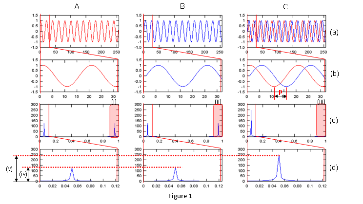
The complex signal puts its energy at one frequency, so its single peak is twice as high as the peak of either real part.
A real cosine has two peaks : a cos θ = (a/2)ejθ + (a/2)e-jθ. The FFT shows the part at +0.05 and the part at -0.05, which appears near 0.95.The complex signal adds the two parts at one frequency : with a = b = 1 and no phase shift, cos θ + j sin θ = ejθ. The negative-frequency parts cancel, and the positive-frequency parts add.The heights confirm it : the signal has 257 samples and 12.85 periods. The peak of A is about 124, and the peak of C is about 248, twice as high.'p' marks a quarter period : the period is 20 samples, and the imaginary part lags the real part by 5 samples. That is 90 degrees, or π/2.
Complex Number FFT - Example 2
Now let me have a question. If a signal is made up of any form of complex numbers, does it produce only ONE peak as we saw in previous example ?
Let's look at the following example to find the answer to this question. I set the variables for my script as follows. (You would notice I set a non-zero value for p2).
a = 1.0;
b = 1.0;
p1 = 0.0;
p2 = 0.2*pi;
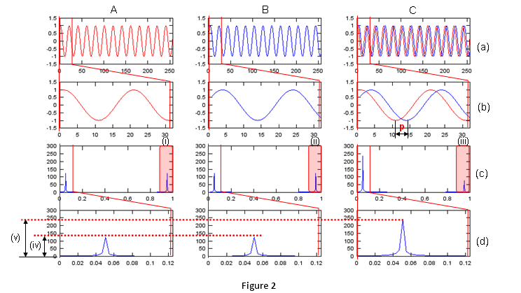
You see three columns A,B,C. A is a real value sequence created by a*cos(2*pi*n/20+p1), B is also a real value sequence created by b*sin(2*pi*n/20+p2) and C is a complex value sequence created by a*cos(2*pi*n/20+p1) + j*b*sin(2*pi*n/20+p2). Since 'C' signal is made up of pure 'cos' (cos() with no phase shift) and sin (in this case this sin() has a phase shift defined by p2). Now the arg of the complex value (the phase difference between the real part and imaginary part) is not exactly 90 degree (pi/2) as indicated as 'p' in Column 'C', row (c) plot.
Now let's look into the graphs on row (c). What do you think the differences among the three graphs on row (c) ? Even though the phase of signal B has been changed, the fft graph for the data doesn't seem to be changed in any way at least in terms of number of peaks or the height of the peak.
But you would notice a big difference between this example and previous example. It is that now even the fft of the complex signal has another peak even though the size of the peak is much smaller than the first peak. You may 'sense' this second peak would be related to the arg changes of the complex value data. To have more concrete 'feeling', try change p1, p2 into various different value and run the script.
Is there any other differences except the number of peaks in FFT plot ? You can find another difference in graphs on row (d). You will notice that the height of the peak of complex valued FFT is much greater than the height of the peak of real valued FFT. How big is it ? But in this case, the large peak of colum C does not seem to be exactly twice as high as (column A, row d) or (column B, row d). If you compare the result of various trials of changing p1, p2, you will have some 'feeling' about the size of peak changes. I will leave this to you.
Complex Number FFT - Example 3
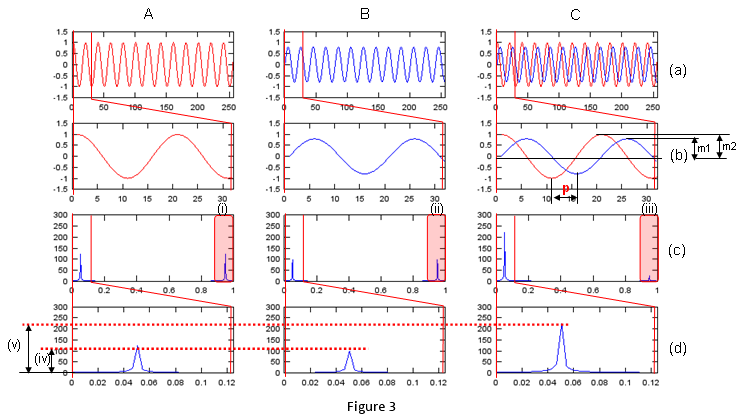
Examples 1 and 2 kept a = b. This example keeps both phases at 0 and makes the imaginary part smaller, with b = 0.8, so only the amplitude balance changes.
Let's make another question. What if I change the amplitude of real or imaginary part of the complex signal without introducing any phase shift ?
My trial parameter is as follows. You should notice that a and b is not the same now.
a = 1.0;
b = 0.8;
p1 = 0.0;
p2 = 0.0;
You see three columns A,B,C. A is a real value sequence created by a*cos(2*pi*n/20+p1), B is also a real value sequence created by b*sin(2*pi*n/20+p2) and now the amplitude of b*sin(2*pi*n/20+p2) is smaller than a*cos(2*pi*n/20+p1). C is a complex value sequence created by a*cos(2*pi*n/20+p1) + j*b*sin(2*pi*n/20+p2). 'C' signal is made up of pure 'sin' (sin() with no phase shift) and cos. Amplitude of real part and amplitude of imaginary part is not same as you see in m1,m2 in the graph (column C, row (b)). Now the arg of the complex value (the phase difference between the real part and imaginary part) is still exactly 90 degree (pi/2) as indicated as 'p' in Column 'C', row (c) plot.
Now let's look into the graphs on row (c). What do you think the differences among the three graphs on row (c) ? Even though the amplitude of signal B has been changed, the fft graph for the data doesn't seem to be changed in terms of number of peaks. Only the height of the peak of B is lower, in proportion to b = 0.8.
But you would notice a big difference between this example and previous example. It is that now even the fft of the complex signal has another peak even though the size of the peak is much smaller than the first peak. You may 'sense' this second peak would be related to the arg changes of the complex value data. To have more concrete 'feeling', try change a, b into various different value and run the script.
Is there any other differences except the number of peaks in FFT plot ? You can find another difference in graphs on row (d). You will notice that the height of the peak of complex valued FFT is much greater than the height of the peak of real valued FFT. How big is it ? But in this case, the large peak of colum C does not seem to be exactly twice as high as (column A, row d) or (column B, row d). If you compare the result of various trials of changing a, b, you will have some 'feeling' about the size of peak changes. I will leave this to you.
Complex Number FFT - Example 4
In previous examples, we saw how separate changes in the amplitude and phase of the complex value data affect the result of FFT. Now let's change both amplitude and phase at the same time see how it influence fft result.
My trial parameter is as follows. You should notice that a and b is not the same now. p1 and p2 is not the same either .
a = 1.0;
b = 0.8;
p1 = 0.0;
p2 = 0.2*pi;
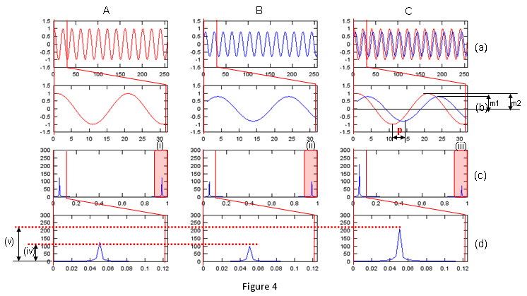
You see three columns A,B,C. A is a real value sequence created by a*cos(2*pi*n/20+p1), B is also a real value sequence created by b*sin(2*pi*n/20+p2) and now the amplitude of b*sin(2*pi*n/20+p2) is smaller than a*cos(2*pi*n/20+p1). C is a complex value sequence created by a*cos(2*pi*n/20+p1) + j*b*sin(2*pi*n/20+p2). 'C' signal is made up of pure 'cos' (cos() with no phase shift) and 'sin'(sin() with phase shift). Now the arg of the complex value (the phase difference between the real part and imaginary part) is not exactly 90 degree (pi/2) as indicated as 'p' in Column 'C', row (c) plot. and Amplitude of real part and imaginary part is also different.
Now let's look into the graphs on row (c). What do you think the differences among the three graphs on row (c) ? Even though the phase and the amplitude of signal B have been changed, the fft graph for the data doesn't seem to be changed in terms of number of peaks. Only the height of the peak of B is lower, in proportion to b = 0.8.
But you would notice a big difference between this example and previous example. It is that now even the fft of the complex signal has another peak even though the size of the peak is much smaller than the first peak. You may 'sense' this second peak would be related to the arg changes of the complex value data. To have more concrete 'feeling', try change a, b and p1,p2 into various different value and run the script.
Is there any other differences except the number of peaks in FFT plot ? You can find another difference in graphs on row (d). You will notice that the height of the peak of complex valued FFT is much greater than the height of the peak of real valued FFT. How big is it ? But in this case, the large peak of colum C does not seem to be exactly twice as high as (column A, row d) or (column B, row d). If you compare the result of various trials of changing a, b and p1,p2, you will have some 'feeling' about the size of peak changes. I will leave this to you.
The four examples follow one formula, and it answers the question left open in Example 1. Let's write the complex signal as two rotating exponentials, with θ = 2πn/20 and p1 = 0:
a cos θ + j b sin(θ + p2) = ((a + b ejp2)/2) ejθ + ((a - b e-jp2)/2) e-jθ
The first term gives the large peak near 0.05. The second term gives the small peak near 0.95. The table below compares the formula with the FFT of the script.
Example | a, b, p2 | Large peak of C / peak of A, formula | Same, from the FFT | Small peak / large peak, formula | Same, from the FFT |
1 | 1, 1, 0 | 2.00 | 2.00 | 0 | 0.01 |
2 | 1, 1, 0.2π | 1.90 | 1.91 | 0.33 | 0.33 |
3 | 1, 0.8, 0 | 1.80 | 1.80 | 0.11 | 0.11 |
4 | 1, 0.8, 0.2π | 1.71 | 1.72 | 0.34 | 0.35 |
The small peak measures the imbalance : it is zero only when a = b and p2 = 0. Any amplitude or phase mismatch between the real and imaginary parts moves energy to the negative frequency. In a radio receiver, this is the IQ imbalance that creates an image signal.The large peak stays below twice the A peak : |a + b ejp2| is smaller than a + b whenever p2 is not 0, and a + b is smaller than 2a whenever b is smaller than a. This is why Examples 2, 3 and 4 do not reach exactly twice the height.The FFT values are slightly off the formula : the 257 samples hold 12.85 periods, not a whole number. So some energy leaks into the neighbouring bins, and the measured ratios differ from the formula in the second decimal.
Phase of FFT
If you look carefully into the mathemtical formual for fourier transform, you would notice exp(-i t) part which is a complex number) and this part applies to every point of the input data. Therefore, the result of FFT is always a sequence of complex number regardless of whether the fft input is real number or complex number. It means each data point (a complex number) in fft result has it's own magnitue and phase. All the fft graph shown in previous sections is based on the magnitude of the fft result, but there are some cases where not only the magnitude part but also phase (arg or angle) part is important. (One example for this kind of case is 'filter design'). In this case, we normaly use both magnitude plot and phase plot to characterize the fft result.
In this section, we would see how the phase value of fft can be represented. To see how most of the mathmatical software represent phase (angle), let's start with a simple and rotating complex value sequence as shown below.
(a) shows the graph of the complex value sequence. Red curve represent the real part and blue curve represent the imaginary part.
(c) shows the graph of the complex value in polar cordinate (or parametric coordinate). As you see, this complex sequence continuously rotating. It means the angle part just keep increasing continuously. But if you plot the phase (angle) in cartesian coordinate (rectangular) plot, you would see abrupt phase changes periodically as shown in (b). This is because of the way the computer software calcuate the phase (angle) of the complex number. So you should be careful about interpreting the phase values of the fft result. Especially when you see an abrupt phase changes (discontinuity of the phase value), you have to think about whether it is the discontinuity from the nature of input data or computer algorithm calculating the phase value.
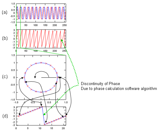
The angle of the rotating sequence grows without limit, but arg() folds it into the range from -π to π.
The jumps are 2π wraps : the sequence turns once every 20 samples, so arg() jumps from +π to -π once every 20 samples. Over 257 samples that is about 13 jumps in plot (b).The data itself is smooth : in (c) the points move around the circle by the same step, 2π/20, which is 18 degrees. Only the reported angle jumps, in (d) between sample 11 and sample 12.unwrap() removes the jumps : Octave and Matlab provide unwrap(), which adds or subtracts 2π wherever the angle jumps by more than π. Use it before you read a slope from a phase plot.
For you intuitive understanding and various experiment, I wrote a small Octave (or Matlab) script as shown below. Just hange the value of a,b,p1,p2 and x (formula for signal generation) and see how the phase plot varies. As I always say, try as much as possible and try to make your own understanding.
n = [0:256];
a = 1.0;
b = 1.0;
p1 = 0.0;
p2 = 0.0;

x = a*cos(2*pi*n/20+p1) + j*b*sin(2*pi*n/20+p2);

subplot(5,1,1);
plot(real(x),'r-',imag(x),'b-'); axis([0 length(x) -1.5 1.5]);
subplot(5,1,2);
plot(arg(x),'r-'); axis([0 length(x) -pi pi]);
subplot(5,1,[3 4]);
plot(real(x([1:21])),imag(x([1:21])),'b-',real(x([1:21])),imag(x([1:21])),'rx'); axis([-1.5 1.5 -1.5 1.5]);
subplot(5,1,5);
plot(arg(x([1:21])),'b-',arg(x([1:21])),'rx'); axis([0 21 -pi pi]);
Followings are just several examples that I tried and I would not explain much about this. Just take a look and have some feeling.
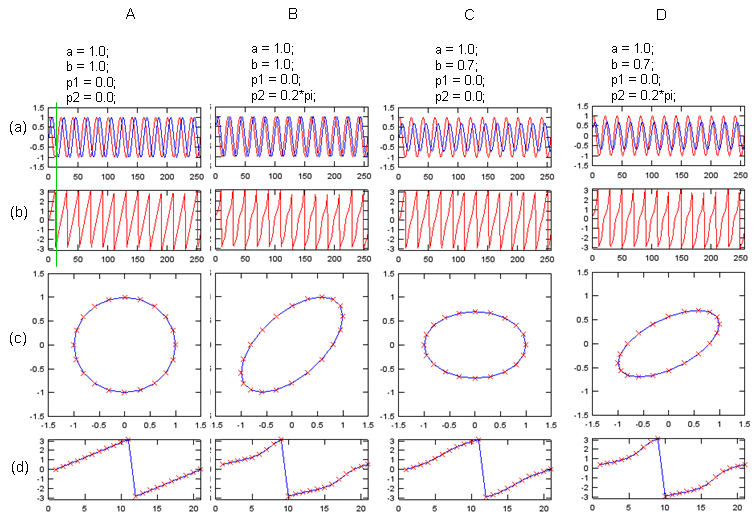
Unequal amplitudes flatten the circle into an ellipse, and a phase offset tilts it.
The four cases : A is the circle. B has p2 = 0.2*pi, and its ellipse is tilted. C has b = 0.7, and its ellipse is flat. D has both settings.The angle no longer grows at a constant rate : in B, C and D the red crosses in row (d) follow a curve rather than a straight line. So the phase of an unbalanced signal speeds up and slows down within each turn.
With the feeling (or some sense) you formed from previous example, let's see the result of the fft for the data we used in previous sections. I added the phase plot of each fft. For now, just try to have some impressions here.. I hope I can explain the meaning of these type of phase changes in filter design session in the future.
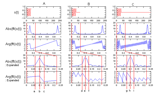
The magnitude peak stays near 0.1 in all three columns, while the phase between the peaks changes quickly.
The columns differ only in zero padding : A uses the 32 samples alone. B pads them to 64 points, and C pads them to 256 points.Read the phase only where the magnitude is large : the phase of a bin with a very small magnitude changes by large amounts with tiny changes in the data. The phase near the peak, at the points b, e and h, is the part that describes the signal.
Following is the script for the above plot.
n = [0:31];
x = cos(2*pi*n/10);

x1 = x;
x2 = [x zeros(1,64-length(x1))];
x3 = [x zeros(1,256-length(x1))];

fft_x1 = fft(x1);
fft_x2 = fft(x2);
fft_x3 = fft(x3);

fft_x1_abs = abs(fft_x1);
fft_x2_abs = abs(fft_x2);
fft_x3_abs = abs(fft_x3);

fft_x1_arg = arg(fft_x1);
fft_x2_arg = arg(fft_x2);
fft_x3_arg = arg(fft_x3);

f1 = [0:length(fft_x1)-1]/length(fft_x1);
f2 = [0:length(fft_x2)-1]/length(fft_x2);
f3 = [0:length(fft_x3)-1]/length(fft_x3);

subplot(5,3,1);
plot(x1,'r-'); axis([0 length(x3) -1.5 1.5]);
subplot(5,3,4);
plot(f1,fft_x1_abs);
subplot(5,3,7);
plot(f1,fft_x1_arg);axis([0 1 -pi pi]);
subplot(5,3,10);
plot(f1([1:length(f1)/4]),fft_x1_abs([1:length(f1)/4]));
subplot(5,3,13);
plot(f1([1:length(f1)/4]),fft_x1_arg([1:length(f1)/4]));axis([0 1/4 -pi pi]);

subplot(5,3,2);
plot(x2,'r-'); axis([0 length(x3) -1.5 1.5]);
subplot(5,3,5);
plot(f2,fft_x2_abs);
subplot(5,3,8);
plot(f2,fft_x2_arg);axis([0 1 -pi pi]);
subplot(5,3,11);
plot(f2([1:length(f2)/4]),fft_x2_abs([1:length(f2)/4]));
subplot(5,3,14);
plot(f2([1:length(f2)/4]),fft_x2_arg([1:length(f2)/4]));axis([0 1/4 -pi pi]);

subplot(5,3,3);
plot(x3,'r-'); axis([0 length(x3) -1.5 1.5]);
subplot(5,3,6);
plot(f3,fft_x3_abs);
subplot(5,3,9);
plot(f3,fft_x3_arg);axis([0 1 -pi pi]);
subplot(5,3,12);
plot(f3([1:length(f3)/4]),fft_x3_abs([1:length(f3)/4]));
subplot(5,3,15);
plot(f3([1:length(f3)/4]),fft_x3_arg([1:length(f3)/4]));axis([0 1/4 -pi pi]);
Effect of multiplying Exp(p i) to the signal
What happens to the FFT when every sample of a signal is multiplied by the same complex number ejp? The product only rotates each sample by the angle p. So we can expect the magnitude to stay the same and the phase to move by p.
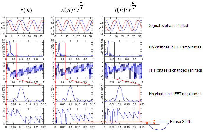
A constant phase rotation leaves the FFT magnitude unchanged and adds the same angle p to the phase of every bin.
The FFT is linear : the factor ejp does not depend on n, so the FFT of x(n) ejp is ejp times the FFT of x(n). Every bin is multiplied by the same unit complex number.The shifts are π/4 and π/2 : the middle column uses p = 0.25π, about 0.79 rad, and the right column uses p = 0.5π, about 1.57 rad. The phase plots move up by these amounts and wrap at π.In a receiver this is a carrier phase offset : a constant phase error rotates the whole constellation, and a single complex correction removes it.
The following listing produces the plots above.
n = [0:31];
x = exp(j*2*pi*n/10);

x1 = [x zeros(1,256-length(x))];
x2 = x1 .* exp(j*0.25*pi);
x3 = x1 .* exp(j*0.5*pi);

fft_x1 = fft(x1);
fft_x2 = fft(x2);
fft_x3 = fft(x3);

fft_x1_abs = abs(fft_x1);
fft_x2_abs = abs(fft_x2);
fft_x3_abs = abs(fft_x3);

fft_x1_arg = arg(fft_x1);
fft_x2_arg = arg(fft_x2);
fft_x3_arg = arg(fft_x3);

f1 = [0:length(fft_x1)-1]/length(fft_x1);
f2 = [0:length(fft_x2)-1]/length(fft_x2);
f3 = [0:length(fft_x3)-1]/length(fft_x3);

subplot(5,3,1);
plot(real(x1),'r-',imag(x1),'b-'); axis([0 length(n) -1.5 1.5]);
subplot(5,3,4);
plot(f1,fft_x1_abs);
subplot(5,3,7);
plot(f1,fft_x1_arg);axis([0 1 -pi pi]);
subplot(5,3,10);
plot(f1([1:length(f1)/4]),fft_x1_abs([1:length(f1)/4]));
subplot(5,3,13);
plot(f1([1:length(f1)/4]),fft_x1_arg([1:length(f1)/4]));axis([0 1/4 -pi pi]);

subplot(5,3,2);
plot(real(x2),'r-',imag(x2),'b-'); axis([0 length(n) -1.5 1.5]);
subplot(5,3,5);
plot(f2,fft_x2_abs);
subplot(5,3,8);
plot(f2,fft_x2_arg);axis([0 1 -pi pi]);
subplot(5,3,11);
plot(f2([1:length(f2)/4]),fft_x2_abs([1:length(f2)/4]));
subplot(5,3,14);
plot(f2([1:length(f2)/4]),fft_x2_arg([1:length(f2)/4]));axis([0 1/4 -pi pi]);

subplot(5,3,3);
plot(real(x3),'r-',imag(x3),'b-'); axis([0 length(n) -1.5 1.5]);
subplot(5,3,6);
plot(f3,fft_x3_abs);
subplot(5,3,9);
plot(f3,fft_x3_arg);axis([0 1 -pi pi]);
subplot(5,3,12);
plot(f3([1:length(f3)/4]),fft_x3_abs([1:length(f3)/4]));
subplot(5,3,15);
plot(f3([1:length(f3)/4]),fft_x3_arg([1:length(f3)/4]));axis([0 1/4 -pi pi]);
Effect of Multiplying Exp(f t i) to the signal
Now let's make the angle grow with the sample index instead of keeping it constant. Each sample is rotated a little more than the sample before it. This rotation changes the frequency of the signal itself, not only its phase.
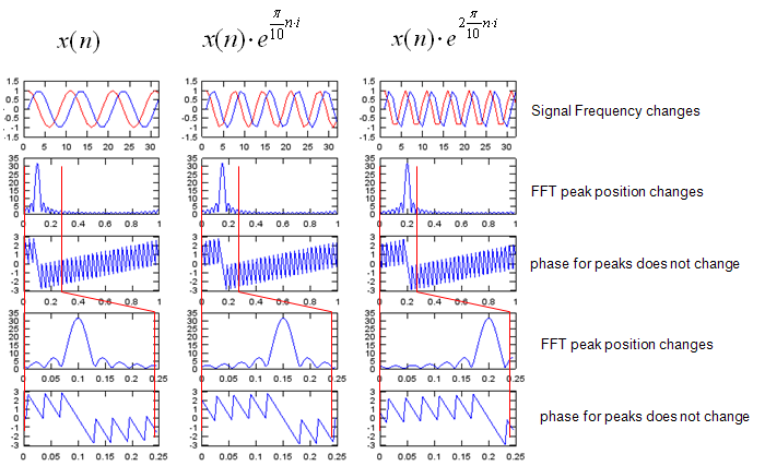
Multiplying by ejω0n moves the FFT peak by ω0/2π without changing its shape.
This is the frequency shift property : x(n) ejω0n has the spectrum X(f - f0), where f0 = ω0/2π.The numbers in the plots : the code uses exp(j*0.1*pi*n) and exp(j*0.2*pi*n), so f0 is 0.05 and 0.1 cycles per sample. The peak moves from 0.1 to 0.15 and then to 0.2.The phase pattern moves with the peak : the whole spectrum shifts as one piece, so the phase near each peak keeps the same shape.Mixers do this in hardware : a radio moves a signal to or from a carrier frequency with the same multiplication. A residual frequency offset in a receiver appears as the same kind of shift.
The following listing produces the plots above.
n = [0:31];
x = exp(j*2*pi*n/10);

x1 = [x zeros(1,256-length(x))];
x2 = [x .* exp(j*0.1*pi*n) zeros(1,256-length(x))];
x3 = [x .* exp(j*0.2*pi*n) zeros(1,256-length(x))];

fft_x1 = fft(x1);
fft_x2 = fft(x2);
fft_x3 = fft(x3);

fft_x1_abs = abs(fft_x1);
fft_x2_abs = abs(fft_x2);
fft_x3_abs = abs(fft_x3);

fft_x1_arg = arg(fft_x1);
fft_x2_arg = arg(fft_x2);
fft_x3_arg = arg(fft_x3);

f1 = [0:length(fft_x1)-1]/length(fft_x1);
f2 = [0:length(fft_x2)-1]/length(fft_x2);
f3 = [0:length(fft_x3)-1]/length(fft_x3);

subplot(5,3,1);
plot(real(x1),'r-',imag(x1),'b-'); axis([0 length(n) -1.5 1.5]);
subplot(5,3,4);
plot(f1,fft_x1_abs);
subplot(5,3,7);
plot(f1,fft_x1_arg);axis([0 1 -pi pi]);
subplot(5,3,10);
plot(f1([1:length(f1)/4]),fft_x1_abs([1:length(f1)/4]));
subplot(5,3,13);
plot(f1([1:length(f1)/4]),fft_x1_arg([1:length(f1)/4]));axis([0 1/4 -pi pi]);

subplot(5,3,2);
plot(real(x2),'r-',imag(x2),'b-'); axis([0 length(n) -1.5 1.5]);
subplot(5,3,5);
plot(f2,fft_x2_abs);
subplot(5,3,8);
plot(f2,fft_x2_arg);axis([0 1 -pi pi]);
subplot(5,3,11);
plot(f2([1:length(f2)/4]),fft_x2_abs([1:length(f2)/4]));
subplot(5,3,14);
plot(f2([1:length(f2)/4]),fft_x2_arg([1:length(f2)/4]));axis([0 1/4 -pi pi]);

subplot(5,3,3);
plot(real(x3),'r-',imag(x3),'b-'); axis([0 length(n) -1.5 1.5]);
subplot(5,3,6);
plot(f3,fft_x3_abs);
subplot(5,3,9);
plot(f3,fft_x3_arg);axis([0 1 -pi pi]);
subplot(5,3,12);
plot(f3([1:length(f3)/4]),fft_x3_abs([1:length(f3)/4]));
subplot(5,3,15);
plot(f3([1:length(f3)/4]),fft_x3_arg([1:length(f3)/4]));axis([0 1/4 -pi pi]);
Reference
[1] Fourier Transform, Fourier Series, and frequency spectrum (YouTube)